Introduction
The Business Intelligence and Reporting Tools (BIRT) is open source software used for reporting. The KNIME Report Designer extension integrates BIRT into KNIME Analytics Platform and allows you to create reports based on the results of your workflows.
This guide describes the KNIME Report Designer extension, and shows how to create simple as well as more advanced reports.
Getting started
The KNIME Report Designer extensions provides a report template for each workflow and nodes to identify those data tables, that should be available within the report. The creation of reports consists of two clearly separated tasks:
-
Prepare the data you want to use in the report. This step is carried out in a KNIME workflow.
-
Design, style and edit the presentation of this data with the report template editor.
Thus, the KNIME workflow editor shows all the preprocessing that is performed on the data in a comprehensive way, while the report template editor reveals how the data will be presented in the report.
The BIRT environment
The concept behind BIRT is fairly simple - in order to create a report, you need to define several elements. These are primarily arranged in two areas:
-
The Master Page, which contains information for headers, footers, and titles common to every page in the report.
-
The Layout, which details how tables, charts, images, text, and other items are arranged.
When you open BIRT for the first time, you should see an environment similar to the figure below. Note that only a single report is associated with a given workflow.
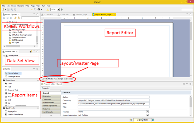
Above, you’ll notice a few different panels:
-
KNIME Explorer, which lists available workflows and groups.
-
Data Set View, which lists all data sets that have been explicitly exported to BIRT from your KNIME workflow.
-
Report Items, which lists available features that we can drag and drop into the report, such as text, tables, images, and so on.
-
Report Editor, which is where we place, edit, and manipulate features we want to include in our report.
-
Property Editor, which has a number of options for formatting and additional editing of our features. For example, you can change fonts, colors, page breaks, data references, and many other options here. The tabs available in this panel change dynamically, based on what we are currently working with in the Report Editor.
The easiest way to learn what the various panels do - and hence, what BIRT itself does - is to create a report! We will do this momentarily. But first, we need a dataset to work with. For our basic report, we will use a dataset of restaurant inspection scores.
Basic reporting workflow
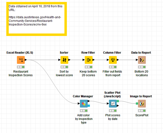
The freely available restaurant scores dataset was obtained from Austin’s Open Data Portal on April 16, 2018. It contains three years of data. It includes restaurant names, numeric IDs, addresses, and ZIP codes, along with associated inspection dates, scores, and descriptions.
Using this dataset, we created a workflow that reads in the data from a Microsoft ® Excel spreadsheet. The data is used to perform two tasks:
-
Identify the twenty lowest observed locations and produce a table containing their information.
-
Create a scatter plot, by date, of all observed scores.
The workflow is presented below. In it, you can see that the data is first read in. For the first task, the data is sorted and filtered to produce a table containing our desired data, and the table is passed to BIRT using the Data to Report node. For the second task, colors are added for inspection type, a scatter plot is produced, and the plot is passed to BIRT using the Image to Report node.
|
By default, the Image to Report node sets the exported image size to 100x100 pixels. This is usually too small for reporting purposes. In this example, we reconfigured the node to output images of size 800x600. |
The workflow and associated dataset is available in the
Node Guide,
or on the EXAMPLES server at /05_Reporting/01_BIRT/07_BIRT_Example_Basic. You
should download the workflow and execute it in full
before continuing with the report creation steps below.
To create a report in BIRT, we should first switch to the BIRT environment. This is done by clicking on the Report icon, shown here:
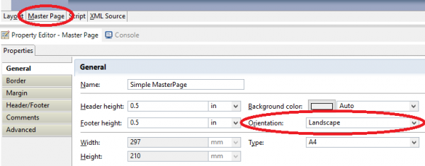
This brings up the interface shown above. First, click on the Master Page tab and set up our page orientation headers and footers in the Property Editor. You will notice that by default, the footer already contains a grid with some text and images about KNIME. We will leave that be, but go ahead and click the Orientation drop-down and change it to Landscape, like so:
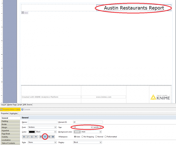
Next, let us add something to spice up the header. It would be nice to have a title for each page, and maybe an image as well. If we want to have two separate items in the header, we should add a grid first. Grids help us to keep things organized in the editor. To do this, drag the Grid icon from the Report Items pane on the left side of the page into the header area at the top of the Report Editor. The header area is denoted by a dashed box colored in light blue. Once you drag over the Grid icon, you’ll see an input box:
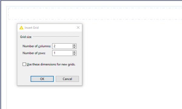
Set the grid size to 2 columns and 1 row, as shown, and click OK. The grid will appear inside the header box. Next, let’s drag a Label icon from the Report Items panel into the rightmost grid cell. You can double click the Label to edit the text inside. Also, when the label has focus, you can edit the text properties in the Property Editor panel at the bottom of the screen. Enter the text "Austin Restaurants Report", change the font size to 24 points, and change the alignment to Center.
Then, add an image to the header. In the leftmost grid cell, drag the Image icon from the Report Items panel. Select Embedded Image from the radio buttons shown, and add an image. I used a map of Texas highlighting the location of Austin.
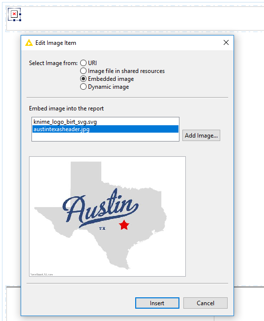
If you need to resize your image, you can click-drag the corners to do so. Similarly, you can click drag the borders of the grid cells to move them as needed.
At this point, you might want to check and see how your Master Page looks outside of the editor. To see a preview, you can click on the View Report icon, which will generate the report in your web browser.The dropdown arrow next to the icon presents options for exporting to other common report formats.
Once you are happy with the arrangement of the Master Page, you can move on to editing the layout of the report.
Creating a report layout
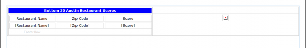
Click on the Layout tab to switch to editing your layout. First, drag in a Grid, and set the dimensions to two rows and two columns. Add a label in the top left cell, using the text "Bottom 30 Austin Restaurant Scores ". Center the label, change the background color to blue, and the text to bold white.
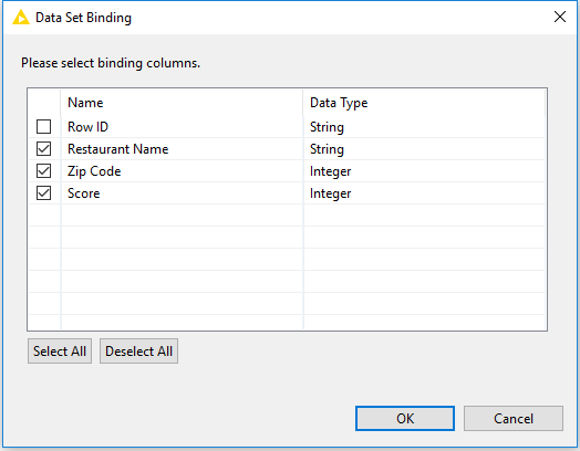
Next, take a look at the items in the Data Set View panel. You should see icons for the Bottom 20 Locations table and Score plot generated from your workflow. Drag the Bottom 20 Locations icon into the bottom left grid cell. When you do, you will be prompted to choose which fields in the dataset to include in the table. Select everything except for Row ID, and click OK.
|
Always give the brown Report nodes in your workflow meaningful names! Otherwise, when you look in the Data Set View panel, you may have a hard time making out exactly what data you passed to BIRT. |
Note that the inserted table consists of a header row, a data cell row, and an empty footer row. Center align the headers and data cells in the table by highlighting them, and clicking the associated button in the Properties panel at the bottom of the page.
Next, place our score plot inside the grid. Right click inside the bottom right grid cell, select Insert, then Image. A new dialogue will appear. Inside this dialog, select Dynamic image, and click the Select Image Data button.
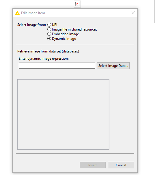
This brings up another dialog. To choose the data that should be bound to this image, select the ScorePlot dataset, and check the box, next to Image. Click OK.
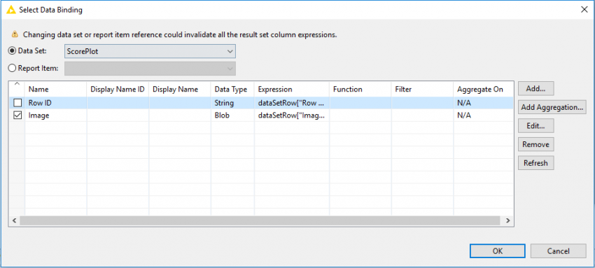
This produces a red X icon inside the cell, which can be disorienting. That is OK — the generated report is going to process the image you selected properly. At this point, the grid in the Layout editor should look something like this:
Highlighting and mapping
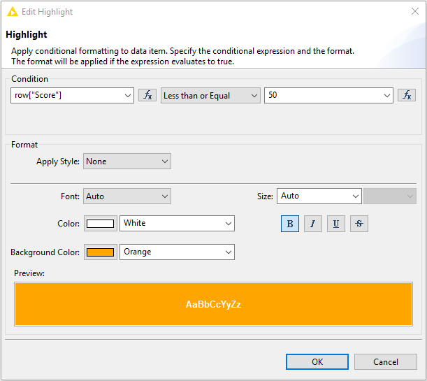
Having completed the layout of our basic report, there are a few more things we can do. For example, what if we wanted to accentuate values in our table, to make them stand out more? This is called highlighting, and is done via the Highlights tab in the Property Editor. Click on the [Score] cell of your data table, and then on the Highlights tab. Click the Add… button to bring up the New Highlight dialog. In the Condition drop down, let’s set Score less than or equal to 50, set the text color to bold white, and the background color to orange, as shown below. This will highlight low restaurant inspection scores in a different color scheme in our report.
What if we wanted to change the representation of values in the table to something else entirely? For example, perhaps we wanted to collapse several numeric values into bins to make them easier to interpret for the reader of our report. This is called mapping, and is done via the Map tab in the Property Editor. For our report, let’s click on the [Zip Code] cell of the data table, and then on the Map tab. Click the Add… button to bring up the Edit Map Rule dialog. In the condition drop down, set the Zip Code equal to 78704 and enter a display value of Downtown, as shown below. In the report, values of 78704 will now be changed to the text string "Downtown".

Report preview and final results
Now, take a look at your report in your web browser using the View Report button. You may also want to generate a PDF to see how that varies from the web preview. My report looks like this:
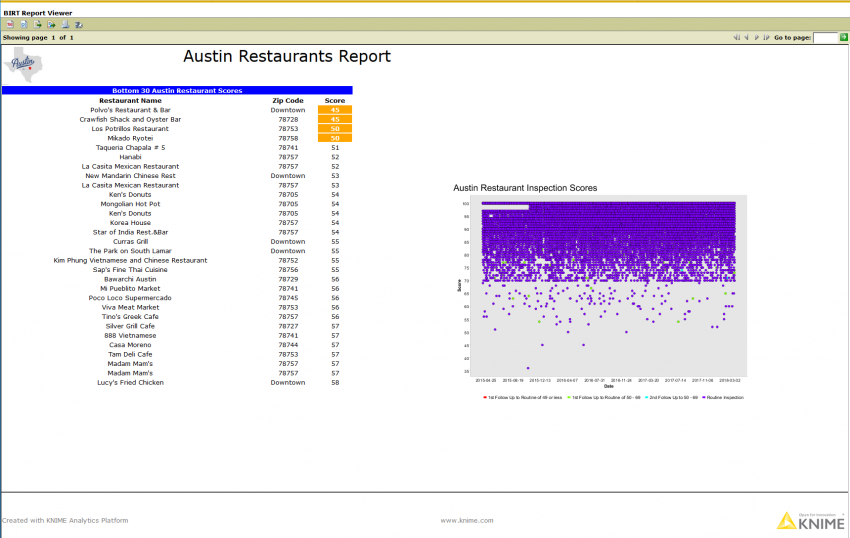
That’s it! You’ve created your first report! Next up, we will create another report that combines some advanced features of BIRT and KNIME Analytics Platform to dynamically generate tables and charts.
Advanced reports
In Getting started, we introduced the KNIME Report Designer. We also introduced the Austin Restaurants dataset, from which we can produce tables and charts of interest. On this page, we will present some advanced BIRT concepts, which you can use to generate more sophisticated visualizations of your data. These include:
-
BIRT breadcrumbs, for easily selecting elements in a report
-
A method for looping and grouping using KNIME workflow functionality
-
A method for grouping using BIRT’s built in capabilities
-
Creating a native BIRT chart, and including dynamic text in BIRT using KNIME flow variables
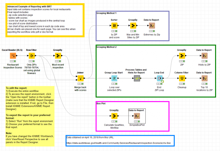
Advanced report workflow
The workflow for this exercise is presented below. In it, we read in data and filter it by ZIP code, using global flow variables. We also perform a quick aggregation using a GroupBy node to obtain the most recent inspection date for each facility, and join that information back with the score data. The processed data is used to perform three tasks:
-
In the green box, we present grouping method 1. This method uses a Group Loop node to produce, for each ZIP code, a list of the top 10 scoring locations, along with a histogram of scores for all locations. It then passes two separate tables to BIRT - one containing the top restaurants, and the other containing the histograms.
-
In the blue box, we present grouping method 2. Here we produce a table of locations with the highest and lowest restaurant scores in each ZIP code, and pass that table directly to BIRT.
-
In the pink box, we present a method to create a box-and-whisker plot using BIRT’s built in chart capabilities. For each ZIP code, the workflow calculates the minimum, maximum, and selected quartiles of the restaurant scores and passes that information to BIRT via a table.
Each of these methods is described in further detail in the sections that
follow. The workflow and associated dataset is available in the
Node Guide,
or on the EXAMPLES server at /05_Reporting/01_BIRT/08_BIRT_Example_Advanced.
You should download the workflow from the EXAMPLES server and execute it in full before continuing
with the report creation steps below.
BIRT breadcrumbs
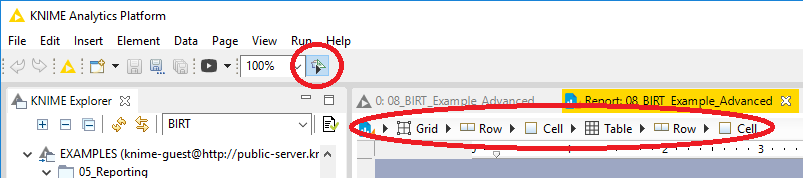
Sometimes, particularly when editing complex BIRT report layouts, it can be difficult to select the exact feature you need just by clicking. For instance, you might need to select an entire table, but instead you find yourself activating a grid cell or table row when you click. An easy way to avoid this problem is by using the breadcrumbs feature in BIRT.
You can turn breadcrumbs on or off by clicking the breadcrumbs button next to the zoom percentage dialog, as shown below. When you do, the breadcrumbs bar will appear at the top of the editor. Now, you can click directly on the breadcrumbs bar itself to drill down to the level of detail you need to select in the editor. The more complicated your reports are, the more often you will find yourself using breadcrumbs!
Grouping method 1 - Loop nodes
Since it is the most straightforward approach, let us start with Method 1. After executing the workflow as described above, go ahead and switch over to the BIRT environment by clicking on the BIRT icon. To begin, create a grid of 2 columns by 2 rows at the top of the layout page. Set the left cells to be about one-third of the page width, and the right cells about two-thirds. Next, from the Data Set View pane on the left-hand side dialog that appears, keep the ZIP Code, Restaurant Name, and Score fields. Go of the screen, drag the Top 10 table into the top left grid cell. From the ahead and set the header fields to be left-aligned and bold, and widen the Restaurant Name field within the table so that it can be read more easily.
Now that you’ve done some simple layout work, let’s involve grouping. Select the table you’ve created - you can do this either by mousing over the table and clicking on the tooltip that appears, or by using the breadcrumbs as described above.
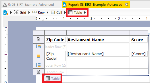
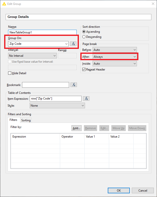
This will allow selection of the Groups tab in the Property Editor at the bottom of the screen. Click Add… to bring up the New Group dialog.
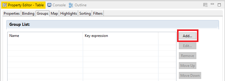
In the New Group dialog, under Group On, select Zip Code. In addition, under the Page Break section, change the After dropdown to Always. This will ensure that the Top 10 table you imported into BIRT will be displayed with a different Zip Code on each page. After clicking OK, our table will be displayed with a subgrouped header for ZIP code in the layout view - this header can be deleted.
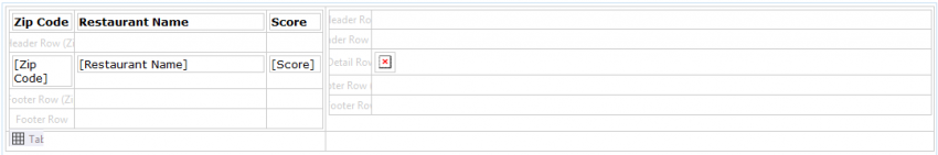
After adding the grouped Top 10 table, bring in the histogram images generated in KNIME. Similar to what was done above, drag the Hists by Zip table to the top right grid cell, keeping only the Zip Code field. Select the table and add a group on Zip Code, setting the Page Break After to be Always. Go ahead and remove the subgroup header for Zip Code. In fact, this time remove the Zip Code itself and all headers, leaving a blank table structure.
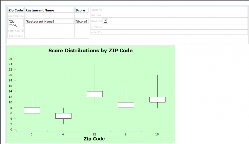
Into this blank grouped table, drag in the Image icon from the Report Items panel. The Edit Image Item dialog will appear. In this dialog, choose Dynamic Image, and click the Select Image Data button.
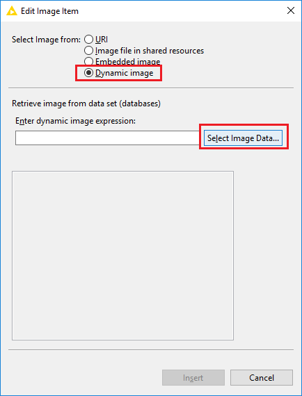
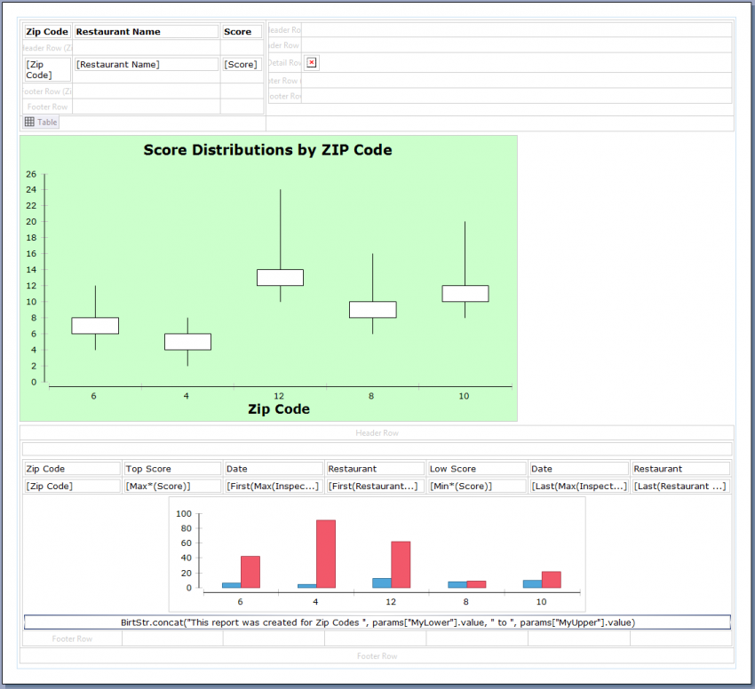
This will open a separate Select Data Binding dialog. Here, choose First(Image), then click OK. Click Insert on the previous dialog to return to the layout editor. This produces a red X in the grouped table of the layout editor, but that’s all right - the image should display properly in our final report. At this point, the layout editor should look something like this:
This is all the setup that is needed for the Grouping Method 1 report. Before we continue, let’s preview the report in the web browser to make sure everything is configured appropriately. Do this by clicking the View Report button in the KNIME toolbar. Note that when you do, you see a dialog in the web browser that looks like this:
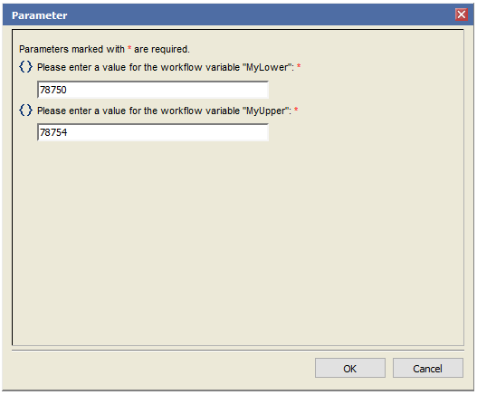
This dialog is asking to confirm the lower and upper bounds for the ZIP codes that were defined, using global workflow variables, in the original KNIME workflow. If you wanted to produce a report based on a different range of ZIP codes, you could change that here. As it is, continue with the default values by clicking OK. The first page of the report should look something like this:
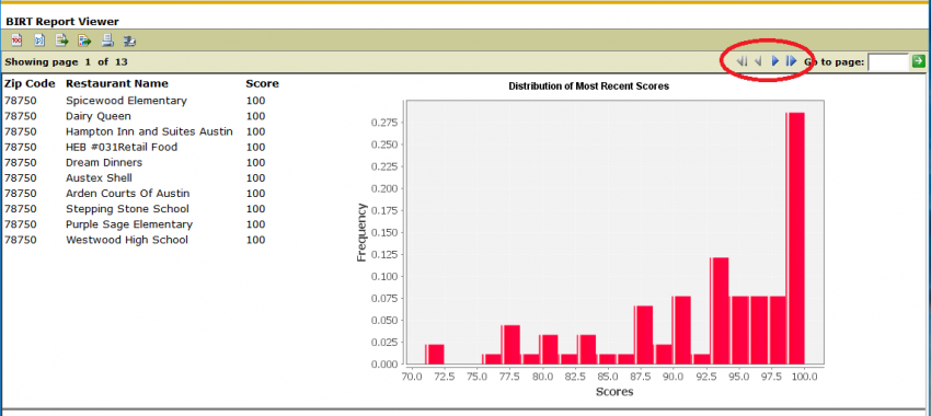
This page presents the top 10 scores for ZIP code 78750, along with a histogram of all scores for that ZIP. If you want to see information for the other ZIP codes, you can navigate the report using the arrows in the top right of the browser window.
Making a box plot using the chart editor
Now, let us make a simple box plot (also known as a box-and-whisker plot) based on our data. Box plots are used to identify, at a glance, how data is distributed. The box displays the Interquartile Range (IQR), which is the range between the 25th and 75th percentiles of the data, while the whiskers represent the range of the minimum and maximum values.
|
There are other ways that whiskers can be used to represent outlying data points; see Wikipedia for more information on this topic. |
To build such a plot, we first calculate for each ZIP code the 25th and 75th percentiles of restaurant scores, along with maximum and minimum scores, using a GroupBy node. We then pass this data to BIRT to build the plot using BIRT’s built-in Chart Editor.
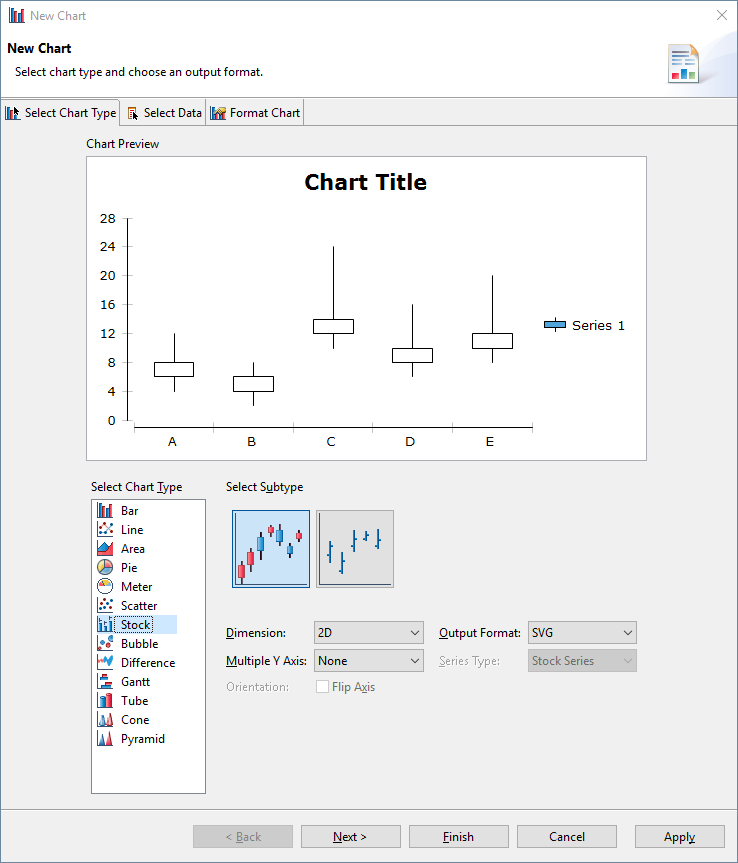
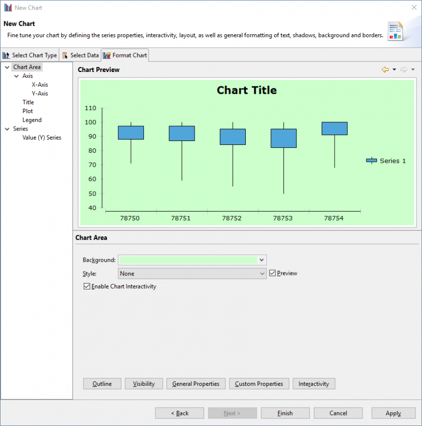
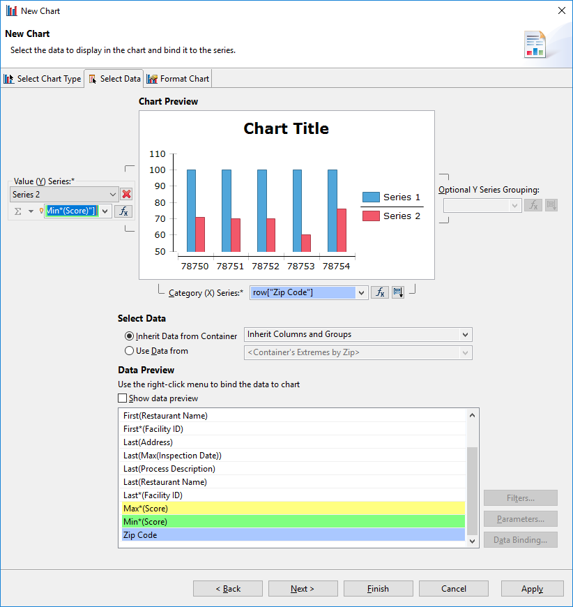
To begin, drag in a Chart icon from the Report Items panel into the blank area below the 2x2 grid. This will open the Chart Editor. On the initial Select Chart Type page, you need only select the Stock chart type from the bottom left panel - you’ll use defaults for all of the other options. Click Next.
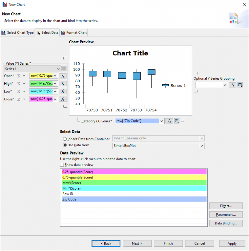
On the subsequent Select Data page, you’ll define the data you wish to use, and how the variables should be represented in the box plot. First, under the Select Data section, click the Use Data from radio button and select SimpleBoxPlot from the dropdown. For the Category (X) Series, choose Zip Code. For the Value (Y) Series, you’ll notice that four inputs are available: Open, High, Low, and Close. For each of the inputs, select the 75th quantile, Maximum, Minimum, and 25th quantiles, respectively. The Data Preview panel will now show color highlights to reflect your choices; if you click the Show data preview check box, you can review the actual calculated values from the SimpleBoxPlot dataset. Click Next.
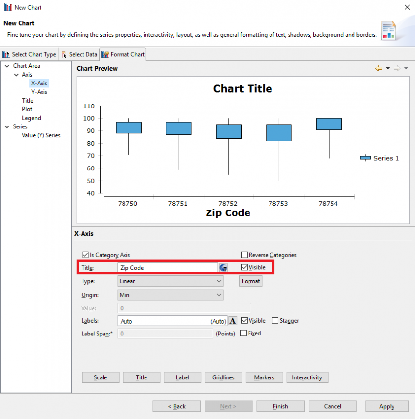
On the final Format Chart page of the Chart Editor, you will see several options for changing the way the chart will be displayed in the BIRT report. First provide a name for the horizontal axis by clicking on X-axis in the left-side pane, clicking the Visible checkbox to toggle display of the axis, and set the name to Zip Code.
You change the name of the chart by making a similar edit on the Title options - set it to Score Distributions by ZIP Code. Since you only have a single series to plot here, get rid of the legend by unchecking the Visible checkbox on the Legend pane as well. Let’s also change the background color to a light green by using the Background dropdown on the Chart Area panel. Click Finish.
You should now see a dummy version of your chart displayed in the layout editor - the data displayed won’t be correct, but the formatting options roughly should be. Drag the bottom corner of the chart to the bottom right to make it larger, and add a page break (After: Always) via the Property Editor as you have done before. At this point, the layout editor should look something like this:
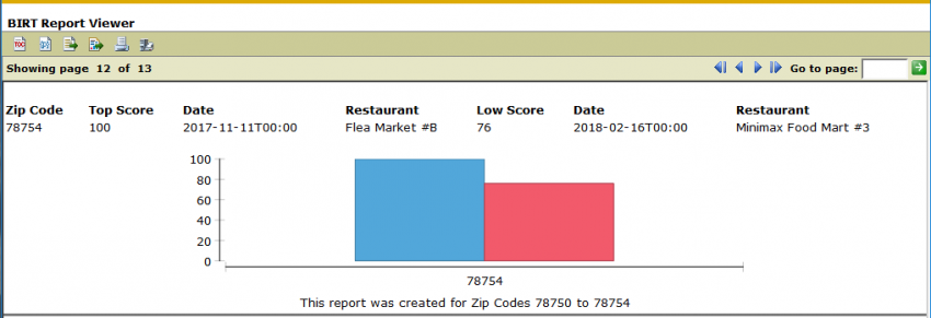
Now take a look at our report in the web viewer. Click on the double arrows to advance to the final page in the report, and you should see something similar to this:
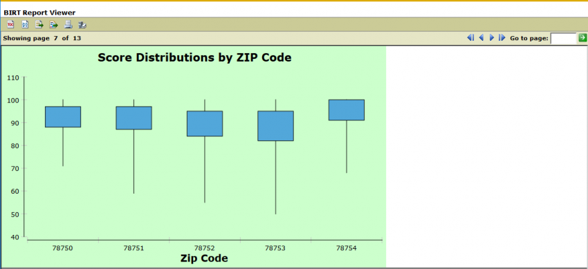
Here we see the final box plot as generated by BIRT. At a glance, you can see that although the extreme minimum values vary somewhat by ZIP code, overall the middle portion of the score distribution does not vary much.
Grouping method 2 - Nested BIRT tables, plus dynamic text
As a final exercise, create a table featuring the highest and lowest scoring locations in a given ZIP code, along with a simple bar chart that displays the relative scores. This time, though, we will approach grouping with a bit of a trick - by nesting a table inside another table, and using some creative filtering.
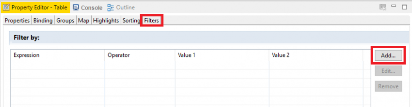
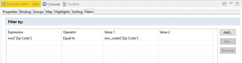
To begin, drag the Extremes by Zip dataset from the Data Set View panel. When the Data Set Binding dialog appears, select only the ZIP Code column. Clear both the header and the cell content, leaving an empty table. Now for the tricky part: drag the same dataset into the empty table you just created. This time, in the Data Set Binding dialog, include all fields except rowID, Facility ID, Address, and Process Description (both First and Last). For the inner table you just created, add a filter by selecting the appropriate tab in the Property Editor and clicking Add….
|
Use breadcrumbs to make sure you’ve selected the inner table, and not the outer table. |
This brings up the New Filter Condition dialog. Here you should select ZIP Code from the dropdown on the left-hand side, and Equal to as a condition. Next you’ll create an expression for the right-hand side of the dialog - you can do this either by clicking the fX button, or by selecting Build Expression… from the dropdown menu.
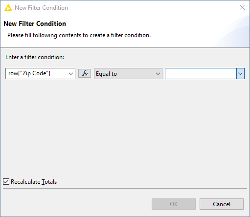
When you do, a separate Expression Builder dialog appears. Here you want to build a string that represents the grouping of the outer table. From the Category heading, choose Available Column Bindings, and from the Sub-Category, choose the bottom Table. Then, double-click on Zip Code to create the string in the Expression field. If you like, you can also just type this string manually into the Expression Builder, but you must be careful to get the syntax precisely correct.
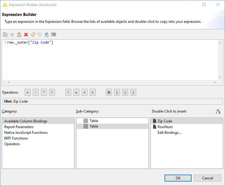
Click OK in both dialogs to navigate back out. You have now created a filter for the data to be displayed in the inner table, that is actually based on the outer table.This has the practical effect of displaying the data for each individual ZIP code.
Now, do a bit of clean up on the layout to make things more legible by renaming the column headers. Also, go ahead and add a page break (After: Always) on the inner table by using the appropriate options in the Property Editor, as you have done before. Next, prepare to make space for our bar chart. Select the inner table, and right-click on the yellow data row icon, choosing Insert → Row → Below.
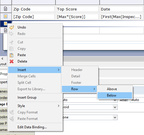
Shift-click to select all of the cells in the newly created row, and choose Merge Cells. You should now have a single blank cell, spanning the width of the table, into which you can drag a Chart icon from the Report Items panel. This will be a simple bar chart that displays the minimum and maximum scores for each ZIP Code, so navigate to to the Select Data tab in the New Chart dialog. The Select Data radio button will already be set to Inherit Columns and Groups, which is what you need. For the X series, choose ZIP Code. For Y Series 1, choose the Max score. Then, add a new series using the dropdown, and for Y Series 2, choose the Min Score.
Under the Format Chart tab, turn off the legend and title using methods shown
above - you will provide our own title dynamically in a moment. Fix the
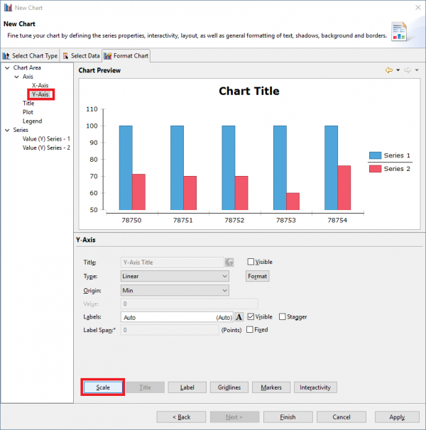
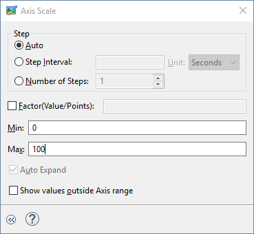
Y-axis scale to values between 0 and 100. Otherwise, the scale of the plot may
change from page to page, which would be confusing to readers. Do this by
clicking on the Scale button associated with the Y-axis, and defining the
scale in the dialog that appears.
|
|
||||||
Click Finish to close the New Chart dialog and place the chart in the Layout Editor. Click-drag the corner of the chart to enlarge it, filling about two-thirds of the empty cell.
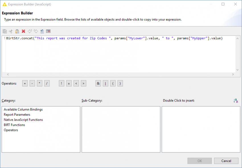
Finally, add a title for our report based on BIRT’s dynamic text feature. This will allow you to change the text in the title based on the ZIP Codes defined in the global workflow variables used to build the report. To do this, drag a Dynamic Text icon from the Report Items panel below the chart you just made. This opens an Expression Builder dialog. Here you will use BIRT’s concatenate function to combine some static text with the values of the workflow variables. Notice that the static text is contained within quotes, while the workflow variables are referenced as parameters within square brackets. Enter the text shown in the figure below into the Expression builder, and click OK.
Now that the layout editing is finished, you should have a layout editor that looks something like this:
If you preview the results of the report in your web browser and skip to the last page, this is the result:
Wrapup and a final caveat
At this point, you have prepared some grouped reports a few different ways, using charts generated in both KNIME and BIRT’s built-in Chart Editor. But there is an additional thing to be aware of before you go - please note that some exports formats from BIRT work better than others. We’ve primarily used the Web Viewer to preview the results of reports in the exercises above, but PDF and PPTX formats work well too. BIRT provides several other options to generate reports, but some of these may produce unexpected results. On top of that, a report that looks fine in one format may look very different in another, so always double check your exported reports to make sure you’re getting the results you want.