Introduction
Data Apps provide a user interface to perform scalable and shareable data operations, such as visualization, data import, export, and preview. In KNIME Analytics Platform, workflow developers can build such a Data App without coding, rather by using workflows. They can then make it accessible to business users by deploying it to KNIME Server, providing the possibility to interact with the data via KNIME WebPortal with no need to touch the workflow that is working under the hood.
With developing a KNIME Data App, a workflow developer has complete control over the interactivity that will be available to the end-user and the complexity of the underlying workflow. Alongside accessing KNIME’s visual programming environment, KNIME Data Apps also provide the possibility to reach out to any number of technologies that are integrated into KNIME’s open ecosystem (scripting languages like Python, machine learning libraries like H2O, etc). Furthermore, through KNIME Server you can also share your Data App with 5, 10, or 1000 end-users with a scope to monitor and tweak based on feedback.
The purpose of this guide is to cement your knowledge about KNIME Data Apps. You will learn how to build your first KNIME Data App from scratch and deploy it to KNIME Server.
Build Your First KNIME Data App
KNIME Data Apps are built using special nodes in KNIME Analytics Platform that allow the user to update the look and feel of each page, build in interaction, and combine multiple pages in the app.
This section provides a step-by-step guide for building and deploying a simple KNIME Workflow as a Data App by building a composite view with re-execution capabilities. Any workflow that is built in KNIME Analytics Platform can be deployed as a Data App, provided the appropriate components are included. This gives the workflow developer significant control over the data science operations and user interface.
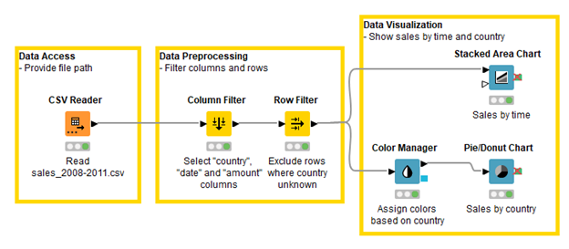
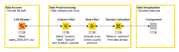
As a starting point, we use the workflow given in the Getting Started Guide and will be adapting the given workflow to build our first Data App. The example workflow demonstrates how to access, preprocess, and visualize sales data.
You can download the initial workflow from KNIME Hub. Follow steps one to five to adapt the workflow and build your first Data App. The resulting deployment-ready workflow can also be downloaded from KNIME Hub.
Step 1/5 – Create a Component
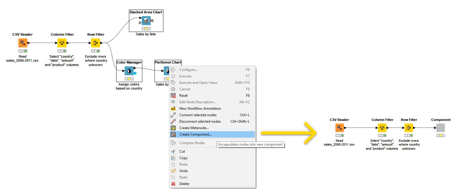
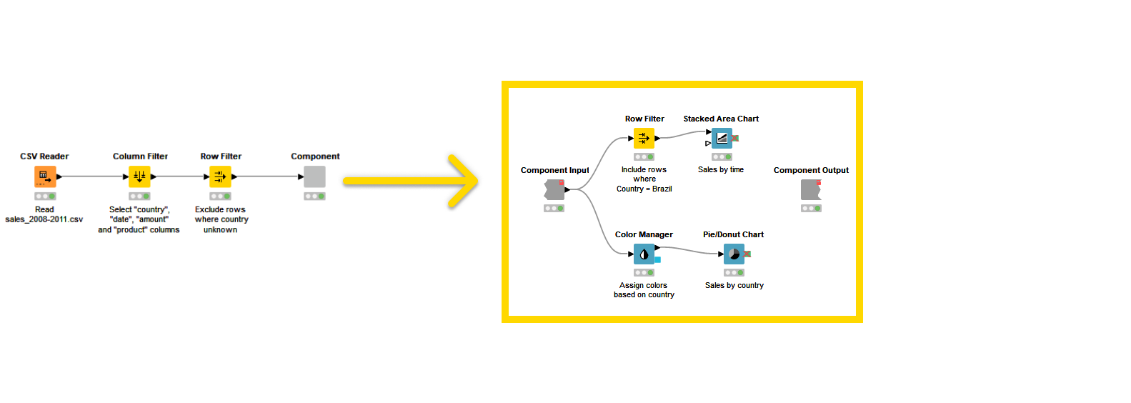
The first step in order to create a Data App is to encapsulate the View nodes in a component. A component in this context is the basic building block of your Data App. In fact, the composite views of all root level components of your workflow will correspond to pages in the Data App. This means that if you have more than one component on the root level, the Data App will be a multi-page application, and the end-user will be able to navigate back and forth through the pages. To create a component you will select the nodes you want to encapsulate, right-click and select Create Component… from the context menu as shown in Figure 2.
If you deploy this workflow on KNIME Server, you can enable other users to start the Data App through KNIME WebPortal. The Data App will comprise a single page that will show the same view of the component you just created.
|
If you add a second component the Data App will be a multi-page Data App and you will enable the end-users to navigate through pages in the KNIME WebPortal via a next button. |
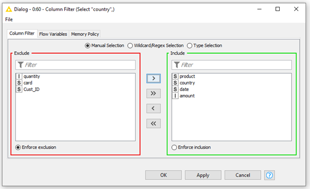
To adapt the given workflow for our analysis we will reconfigure the Column Filter Node in the given example to include some of the columns that were previously excluded as shown in Figure 3.
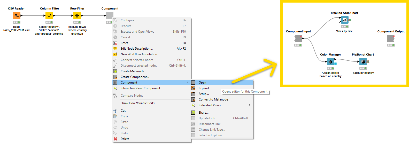
Now, you might want to give the end-user of the Data App the opportunity to explore the data further, like to configure the view on data or filter the data. For example, you can add specific filter options in the component. To do so first open the component encapsulated in the preliminary step to add additional nodes. To open the component, right-click it, select Component > Open as shown in Figure 4.
For example, suppose you would like the end-user to view only sales by time for a specific country “Brazil”. You can add a Row Filter node in the component, as shown in Figure 5, and configure it to show results for Brazil.
Step 2/5 – Add Widget Node
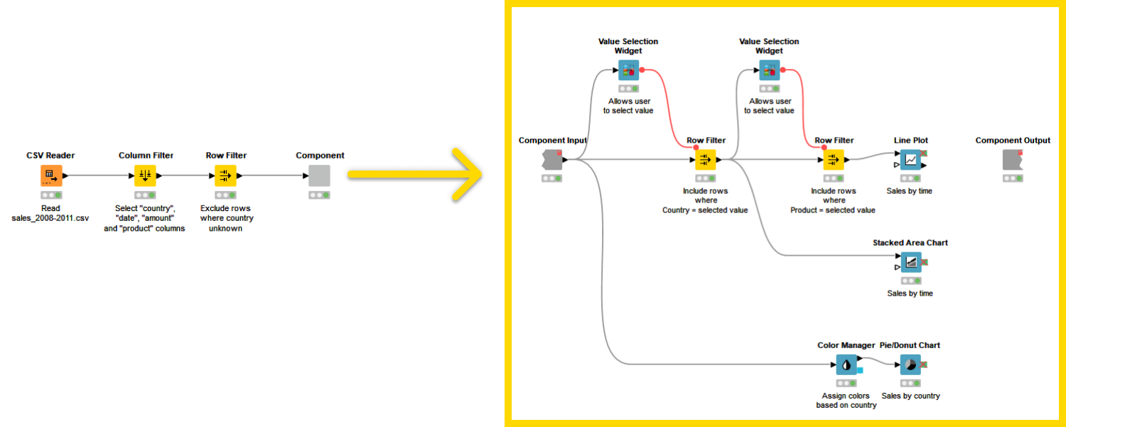
Up until now, we have manually configured the Row Filter node to display and analyze specific data. For the given example, to allow the end-user to select which country to analyze without having to explicitly change the configuration of the Row Filter node, you can use a Widget node.
The Value Selection Widget node gets the data you want to filter as input flow variable that reflects the user choice on the Widget node. The Row Filter node will then be configured to use the incoming flow variable to filter rows that have the value of Country equivalent to the flow variable. Let’s assume you want to analyze further and view sales over time for a specific Product in each country’s record as a line plot. To do so add another Value Selection Widget as a downstream node to the first Widget node as shown in Figure 6.
Step 3/5 – Add Refresh Button Widget Node
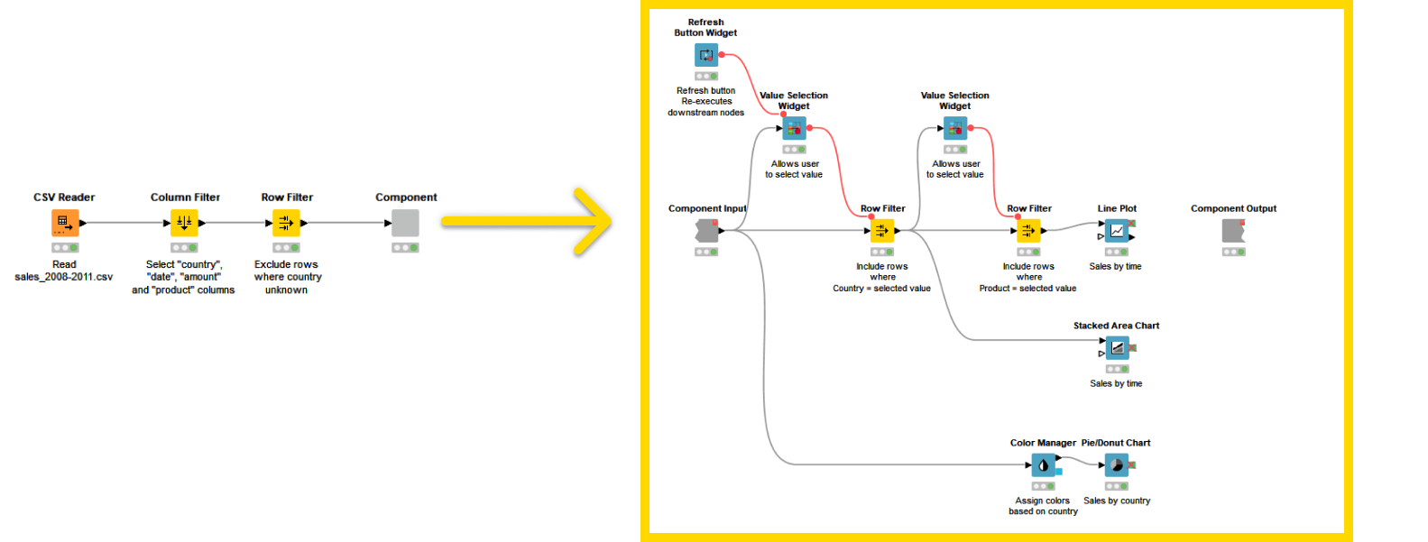
Now, you need to make sure that the desired visualizations will update according to the configuration options selected through the Widgets. To do so you need to add re-execution capabilities to the workflow. Add a Refresh Button Widget node and connect its flow variable port to the Widget node, as shown in Figure 7. This will add a Refresh Button in the visualization.
|
In addition to Refresh Button Widget it is also possible to configure the Value Selection Widget node so that the change in the value in the composite view upon user interaction will directly trigger re-execution of the component downstream nodes. This will result in the update of the visualizations of the composite view corresponding to the Widget and the View nodes that are in the branch downstream to the re-executable Widget node. In order to activate this option open the Widget node configuration dialog, go to the Re-execution tab, and check the option Re-execution on widget value change. Refer to Re-execution of Widget Nodes section for more details. |
Step 4/5 – Add Domain Calculator Node (Optional)
The Value Selection Widget still shows the label option ‘unknown’ for Country. To skip the ‘unknown’ option in the selection widget you can use a Domain Calculator node before the component. It will recalculate the domain and apply the filter to the data. The complete workflow is shown in Figure 8
When the workflow is executed you can right-click the component and select Interactive View: Component from the context menu. This will show the available Views and Widgets that have been encapsulated in the component. From here you can interact with your Data App, e.g. for testing purposes.
Step 5/5 – Change the Layout of the Composite View
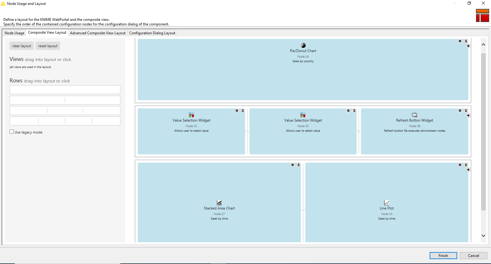
Finally, you might want to change the layout of the composite view. You can do this through the Visual Layout Editor, that provides a simple drag and drop approach to get a layout of your choice. To do so, right-click the component and click Open. The layout editor button in the toolbar is now accessible to you as shown in Figure 9.

You can adjust the layout by defining which Widget and View nodes should be displayed next to or below each other. Refer to Figure 10.
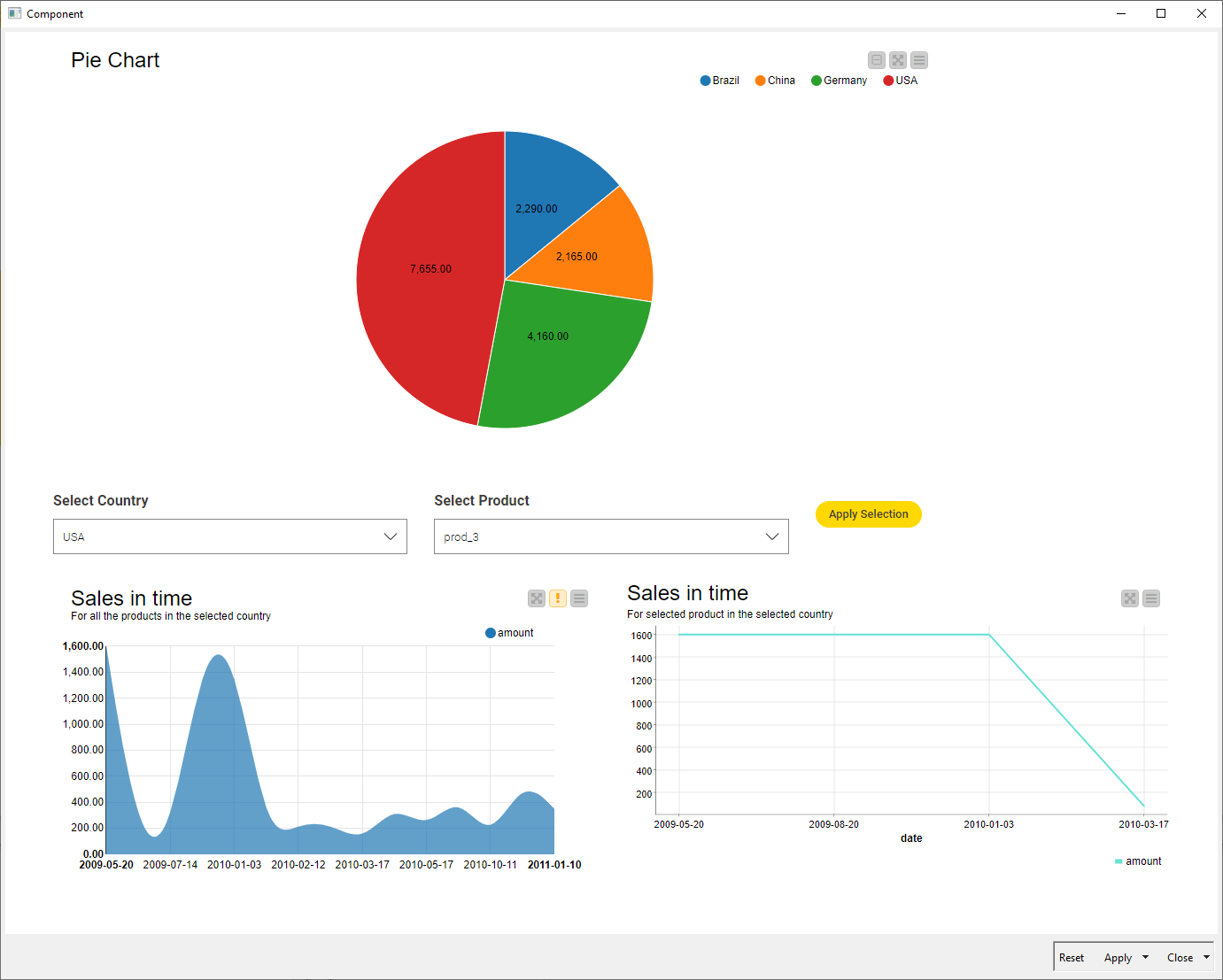
The final Interactive Composite View that would be visible to the user upon workflow sharing is depicted in Figure 11.
Data Apps for KNIME WebPortal
KNIME WebPortal provides a web interface that lists all accessible workflows deployed to KNIME Server, enabling their execution and investigation of results. The input and output of workflows can be parameterized, and their visualizations customized, using Configuration and Widget nodes, Interactive Widget and View nodes.
Workflows are published on KNIME WebPortal by simply uploading the workflow from the local workspace to the corresponding KNIME Server mount point. One major significance of Data Apps relies on making these interactive views available to any user in your organization via a web browser. Follow the given steps in order to deploy a Data App to KNIME WebPortal.
Don’t you have access to a KNIME Server, yet? Click here to learn more about this tool!
Step 1/4 – Connect to KNIME Server
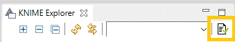
In KNIME Analytics Platform go to the KNIME Explorer and click the preferences button in the toolbar as shown in Figure 12.
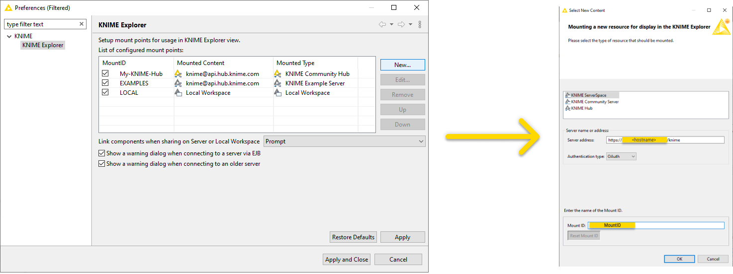
In the preferences window, click New… to add the new Server mount point. In the Select New Content window, shown in Figure 13, select KNIME ServerSpace and insert the Server address:
For more information refer to the section on how to connect to KNIME Server in the KNIME Server User Guide.
Step 2/4 – Deploy Data App on KNIME Server
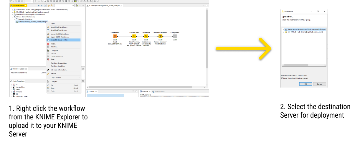
To deploy the Data App to your KNIME Server, right-click the workflow in the KNIME Explorer and select Upload to Server or Hub from the context menu. Then select the destination Server in the Destination window, as shown in Figure 14. Check the option Reset Workflow(s) before upload and click Ok.
Step 3/4 – Run a Data App on KNIME WebPortal
To open the Data App in KNIME WebPortal, right-click the workflow in KNIME Explorer, select Open and then select in WebPortal. Alternatively, you can use a standard web browser to connect to KNIME WebPortal. The address (URL) to get to the login page is:
https://<server-address>/knime/webportal/
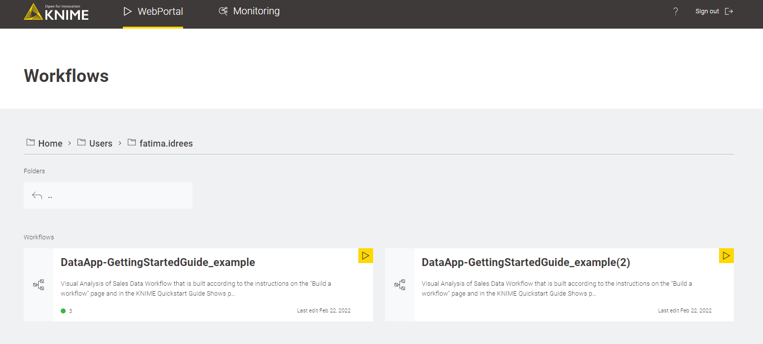
After signing in, the main page for the KNIME WebPortal is displayed, showing the available spaces or workflows. For more information on KNIME WebPortal read about Navigating KNIME WebPortal. Clicking the folder of interest redirects you to a new page, as shown in Figure 15, where all the workflows available inside the folder are shown. You can click the yellow "play" button in the upper-right corner of the corresponding tile to execute the workflow.
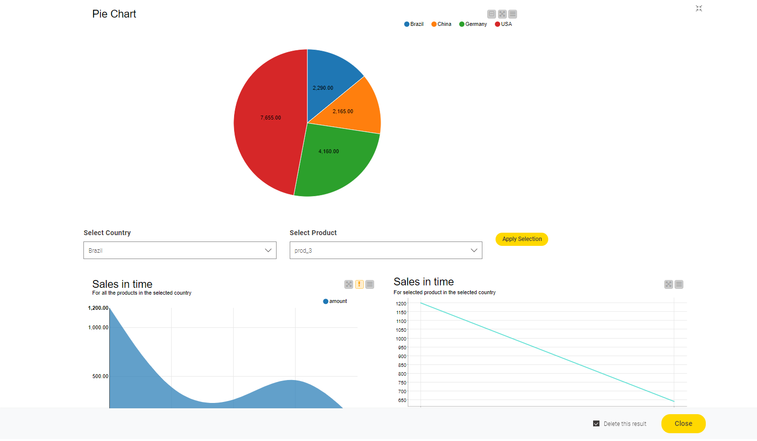
Alternatively, you can also click the workflow tile and click the "Run" button to execute the workflow. After running the workflow, the result will be displayed as a single page Data App since there is only one component as shown in Figure 16.
The following points about the Data App are worth noting:
-
Each page of your Data App will depict the execution of one component which encapsulates widgets, views, and intermediate nodes.
-
You can define the layout of each component.
-
Parts of a page that should be updated after a user input are implemented via a Refresh Button Widget node or the Re-execution tab of a Widget node (optional).
Step 4/4 – Share (or Embed) your Data App
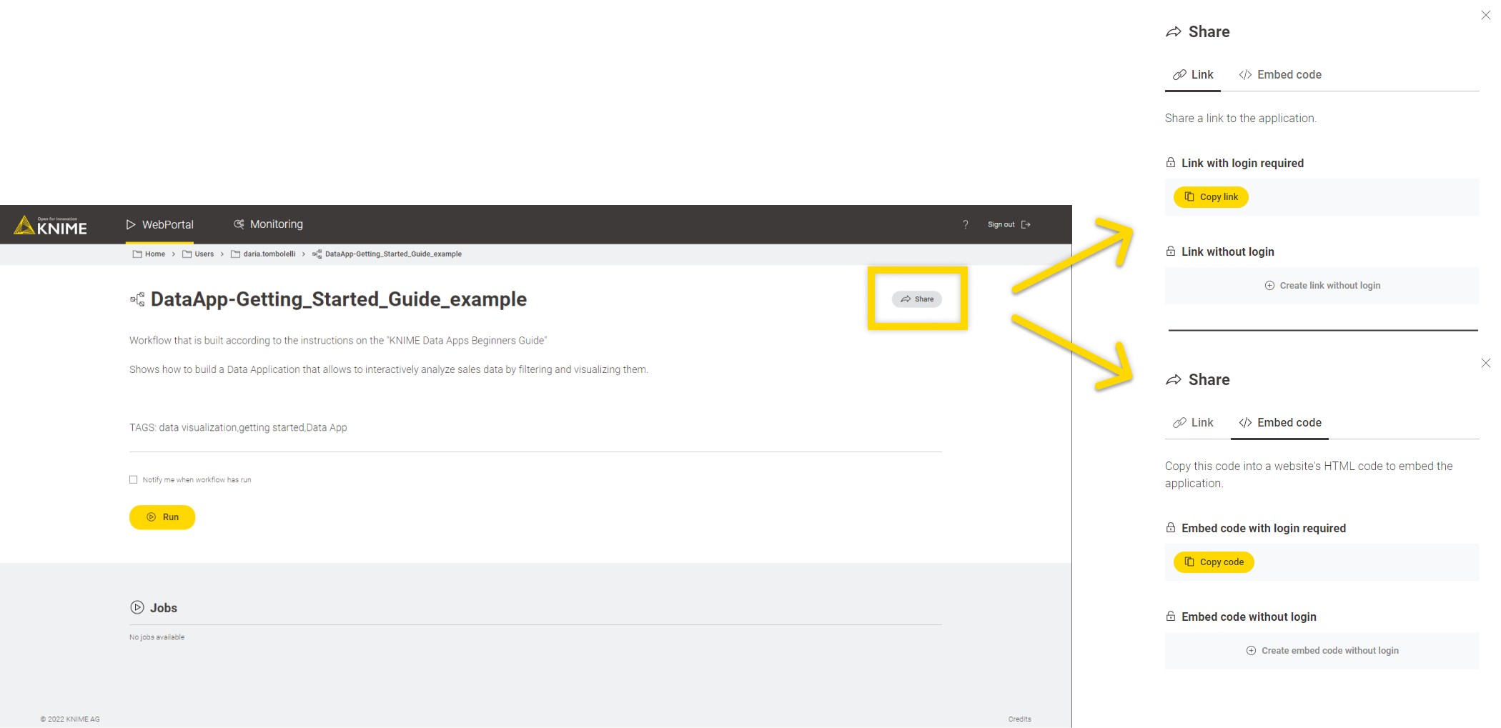
You can share the executed workflow with your colleagues who will only need to interact with the executed webpage on the KNIME WebPortal, without having to worry about the underlying workflow. This can be done by clicking the Share option on the top left corner of the workflow page. You can either use the share link or the embedded link. Refer to Figure 17.
Now that you have successfully built and deployed your first Data App on KNIME WebPortal for more examples on how to deploy interactive, composite views built on KNIME Analytics Platform as Data Apps with KNIME WebPortal refer to the blogpost on KNIME Data Apps Design.
To find additional explanations on how to use KNIME WebPortal and how to build specific workflows refer to the Data Apps for KNIME WebPortal section of the KNIME WebPortal User Guide.
Glossary
Component
A component in Data Apps will provide a composite view as a single page in the browser. In general, a component is an isolated block of logical operations in a KNIME Workflow that can be encapsulated inside a component. A component can have its own configuration dialog and can also be assigned a view. Components enable you to bundle functionality for a particular part of the workflow and allow sharing and reusing. For more information refer to KNIME Components Guide. Widget nodes, View nodes, and Refresh Button Widgets are encapsulated together to form a component in KNIME Data Apps.
Composite View
Composite views contain the interactive views of Widget nodes, Interactive Widget nodes, and View nodes, that are encapsulated within a component. All composite views on the root level also define a web application, accessible through KNIME WebPortal. In order to inspect the composite view in KNIME Analytics Platform, once the execution is done, right-click the component and select Interactive View. The layout of the composite view is also customizable. You can edit the appearance of the component’s composite view with the Visual Layout Editor. For more details refer to the Layout of composite views section.
Widget nodes
You can use Widget nodes inside a component to build a composite view that will be visualized as a web page on KNIME WebPortal. The use of Widget nodes is aimed to set specific configurations, e.g to filter a data table by selecting a value from a specific column. On the web page, you will then be able to enter values for specific parameters before proceeding with the workflow execution. These values are injected into the workflow and used to parameterize its execution.
Interactive Widget nodes and View nodes
You can use Interactive Widget nodes and View nodes inside a component to build a composite view that will be visualized as a web page on KNIME WebPortal. View nodes are used to build specific visualizations, like tables, charts, and plots, which are displayed as web pages. Interactive Widget nodes can be also used alongside the View nodes in order to interact with the visualizations directly on the web page.
Re-execution of Widgets
In addition to the functionality of the Refresh Button Widget node, it is also possible to configure some of the Widget nodes (Selection Widget node and Boolean Widget node) so that the change in their value in the composite view upon user interaction will directly trigger re-execution of the component downstream nodes. You can read more about it in the Re-execution of Widgets section.