
Share Your Work with Components
Introduction
In this guide we introduce components and metanodes.
Components and metanodes are both built from wrapped workflows.
Components really are KNIME nodes that you create which bundle functionality, have their own configuration dialog and their own composite views. Metanodes on the other hand are containers of a part of your workflow, that help to build cleaner and structured nested workflows.
In this guide, we explain how to create components and metanodes, how to create composite views and configuration dialogs for components, and how to use them.
Components vs metanodes
Components are nodes that contain a sub-workflow, which lets you bundle functionality for sharing and reusing. Components encapsulate and abstract functionality, can have their own configuration dialog, and custom interactive composite views. You can use them to hide some complexity in a workflow and you can also reuse them in other workflows or in different parts of the same workflow, or you can share them with others via KNIME Server or on the KNIME Hub. Additionally, components and their composite views are also used to define pages in web application workflows, which once uploaded to KNIME Hub can be deployed as Data Apps.
In contrast to components, metanodes are purely used to organize your workflows better: you can take parts of a larger workflow and collapse it into a metanode, hiding that part of the workflow’s functionality.
The main differences are:
- Custom configuration dialogs: components can have custom configuration dialogs, which are managed through the Configuration nodes
- Custom composite views: components can also have composite views, which are acquired from the interactive views of Widget nodes and View nodes inside the component
- Sharing: components can be shared via KNIME Hub while metanodes can not
- Flow variable scope: the flow variable scope of a component is local which makes them self-containing and less polluting to the parent workflow. A flow variable defined inside a component is by default not available outside it, and a flow variable defined outside the component is by default not available inside it.
Creating components and metanodes
To encapsulate nodes into a component or collapsing a set of nodes into a metanode follow these steps:
Select the nodes by either:
- Dragging a rectangle with the mouse over the nodes in the workflow editor
- Press and hold the "Ctrl" button and select the nodes clicking them
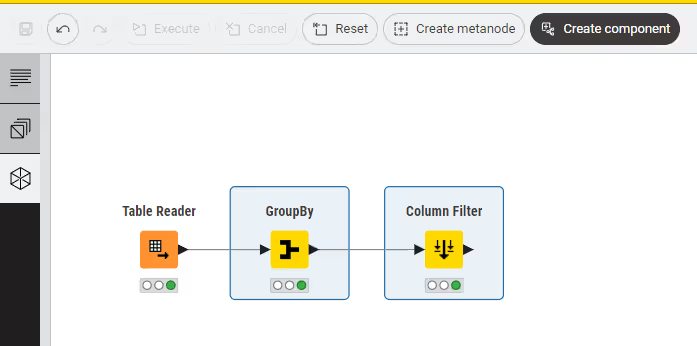
Create a component by:
Clicking the Create component button at the top of the Workflow Editor
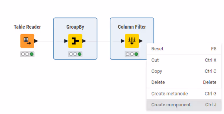
Alternatively, right-click the selection and select either Create component or Create metanode in the context menu shown here
Give the component or metanode a name
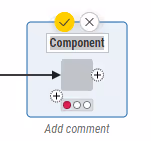
Press Enter or click the yellow tick on top to confirm the name. You will see the new component or the new metanode in the workflow editor in place of the single nodes:
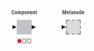
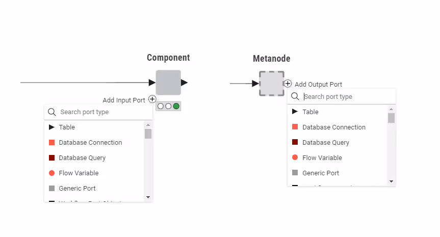
Appropriate input and output ports will appear for the component and the metanode based on the connections coming into and out of it.
Notice that collapsing nodes into a component or a metanode resets the nodes. Confirm with OK in the dialog.
Setup components and metanodes
You can change different settings for components and metanodes, like name, number of input and output ports and their types. Moreover, you can change metadata, description and customize the icon of a component. In this section we will explain you how to setup and reconfigure components and metanodes.
Setup components and metanodes
You can change the settings of a component directly in the workflow editor.
Here you can:
- Change the component name by double-clicking on it.
- Add input and output ports
Click the Add Input Port or the Add Output Port button to right of the component or metanode.
Reconfigure components and metanodes
Remove input and output ports Remove existing input and output ports by clicking on the port you want to remove. A Remove port button appears. Notice that you have to remove from inside the component or metanode, all connections coming to and from the port before you can remove it.
Expand components and metanodes
To return the nodes within a component or a metanode into their original, uncollapsed state, right-click the component or metanode and select Component → Expand component or Metanode → Expand metanode in the context menu.
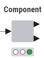
Execution state of components and metanodes
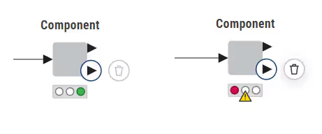
Similar to regular KNIME nodes, components can be configured and executed. How to create a component configuration dialog will be explained in Custom components configuration dialogs section. Components use a traffic light to indicate their execution state, same as for the nodes as shown in the Workflow Editor & nodes section of the KNIME Workbench Guide. In order to access data at the output port(s) every node of the sub-workflow enclosed in the component needs to be successfully executed, hence have a "green" traffic light.
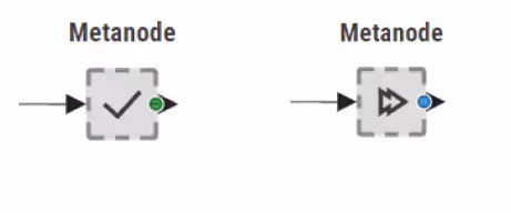
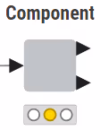
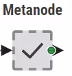
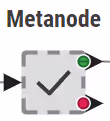
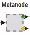
Metanodes can also be executed, meaning that the nodes building up the sub-workflow contained by them, will be executed. However, since metanodes are only containers of parts of the workflow they themselves can not be configured. Only when all of the nodes inside the metanode are executed successfully, the metanode is executed successfully. A metanode has two execution states: A tick indicates that the metanode is executed. A double arrow indicates a running execution.
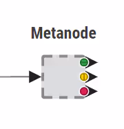
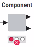
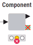
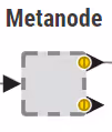
Metanodes have three output states:
- Accessible ("green" dot), meaning that all the nodes building the sub-workflow branch connected to that output port are successfully executed
- Connected but empty ("yellow" dot), meaning that the sub-workflow branch connected to that output port did not produce an output
- Disconnected ("red" dot), meaning that the port is not connected to any sub-workflow’s node.
This metanode has three different states for its output ports:
Component state icons
| State Icon | State Description | Output Description |
|---|---|---|
 | Successfully executed | All outputs available |
 | Configured | All outputs connected |
 | Execution failed | Contains unconnected output |
 | Execution failed | One branch failed |
Metanode state icons
| Icon | Output Description |
|---|---|
 | Successfully executed All outputs available |
 | All nodes of the sub-workflow are configured All outputs connected |
 | All nodes of the sub-workflow are executed Contains unconnected output ("red" dot) |
 | All nodes of the sub-workflow are executed One branch failed and the corresponding output is empty ("yellow" dot) |
Change the flow variables scope in components
Flow variables that are created inside the component have a local scope and are only available inside the component. Flow variables that are not created within the component are only available outside the component.
To change this you need to specifically allow the flow variable to exit or enter the component:
Right-click the component in the executed state and choose Component → Open component from the context menu
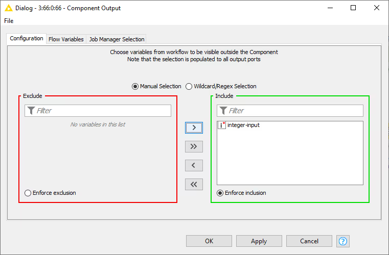
From inside the component right-click the Component Output node and select Configure if you want a locally created flow variable to exit the component, or the Component Input node to allow an externally created flow variable to be available within the component
Add the desired flow variable in the Include column on the right pane in the window that opens.
Custom components configuration dialogs
Components can be designed in a way that the user can configure it from the outside, without having to change the configuration of the nodes inside it, once the component is saved and shared. This is done by using the Configuration Nodes which help to expose the necessary settings to the outside, through the component configuration dialog.
In this section, we explain how to create a custom configuration dialog for a component using Configuration nodes.
You can also change the order of the panes in the layout of the configuration dialogs. For more details about how to do this please refer to the Layout of configuration dialogs section.
Configuration nodes
A Configuration node can provide input parameters for other nodes in the workflow. If you use one or more Configuration nodes inside a component, the configuration dialog of the component will show all these configuration options you created inside it in its custom configuration dialog.
Configuration nodes enable different types of user inputs such as string input, integer input, selecting one value in a list and more.
To access configuration nodes, navigate to the node repository within the KNIME Analytics Platform. Type the key word "configuration" into the search bar.
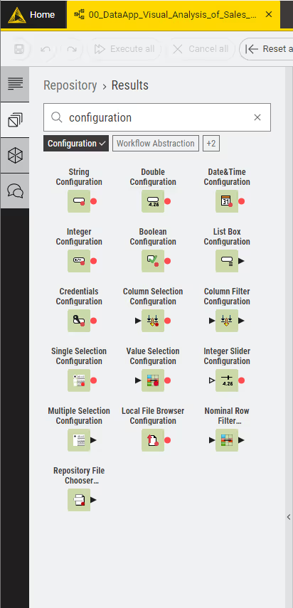
You can narrow down the results by selecting the tag "Configuration" below the search bar.
Configuration nodes
| Icon | Configuration Node | User Input | Output |
|---|---|---|---|
 | Boolean | Booleans Checked = true / Unchecked = false | Boolean |
 | String | Any user input is accepted | String |
 | Integer | Integer values | Integer |
 | Integer Slider | Value on a slider | Integer |
 | Double | Floating point numbers | Double |
 | Date&Time | A date and time (as string or selected from calendar) | String |
 | Credentials | User credentials (username and password) | Credentials Flow Variable |
 | Local File Browser | Select one or multiple local files | Table with paths to selected items (as knime:// protocol). First path is also output as flow variable. |
 | Repository File Chooser | Select one or multiple local files, workflows or folders | Table with paths to selected items (as knime:// protocol). First path is also output as flow variable. |
 | List Box | Separate string inputs | Data table with a column of string values |
Selection Nodes
| Icon | Configuration Node | User Input | Output |
|---|---|---|---|
 | Single Selection | Choice of the available values. The available selection depends on the node’s configuration. | String |
 | Multiple Selection | Multiple selections | Data table with a column of selections |
 | Column Selection | Column name | String |
 | Value Selection | Value in a column | String |
 | Column Filter | Select columns from a data table | Data table with selected columns |
 | Nominal Row Filter | Value in a column | Data table with row filtered according to the selected value |
This is an example of a configuration dialog of the Value Selection Configuration node, where you can define the input label, description, default selection option, and some visual properties:
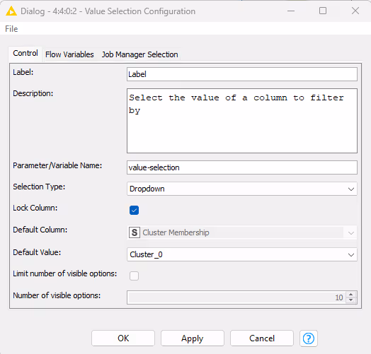
Here, you can also define the name and default value of the output flow variable, along with other settings to control the appearance of the custom dialog, if the Configuration node is used inside a component, as explained in the next section.
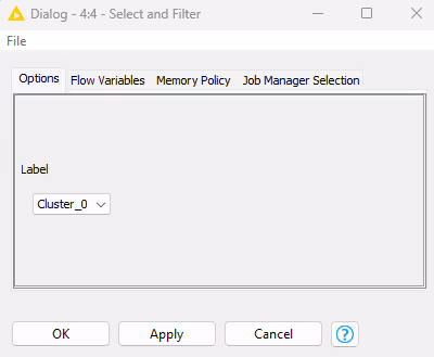
Another node can access the flow variable output of a Configuration node, if the flow variable output of the Configuration node is connected to it, as shown here:

The flow variable created in the Configuration node as output, will then be used to overwrite the settings of the connected node. To know how to do this, please refer to the Overwriting settings with flow variables section of the KNIME Flow Control Guide. The value of the output of the Configuration node is either its default value defined in the Configuration node configuration dialog, or corresponds to the value provided by the user in the custom component configuration dialog.
This workflow is also available on the KNIME Hub.
Component configuration dialog
Configuration nodes that are contained in a component, represent a customized configuration dialog.
Once you create a component, right-click the component and select Configure from the context menu to open the configuration dialog and configure the component’s parameters.
You can also combine different Configuration nodes in one component and have a more complex component configuration dialog, where different parameters can be configured.
Scripting Components
KNIME provides a possibility to implement desired component functionality through scripting by supporting a number of scripting frameworks. You will also have the possibility to integrate dependencies with the scripted component. Given below are the nodes that can be used to script a desired component.
KNIME Scripting Nodes
| Node | Description |
|---|---|
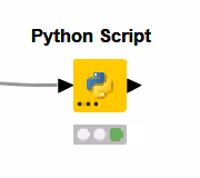 | Offers a code editor for Python to process any number and type of inputs into outputs. KNIME executes the Python installation configuration either from the node settings and/or from KNIME Preferences. |
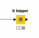 | Offers a code editor for R to process a KNIME table. KNIME executes the R installation configuration either in the node settings and/or in KNIME Preferences. |
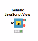 | Offers a code editor for JavaScript to implement a customized view. Optionally, you may feed in data to visualize it based on your implementation. The node offers checkboxes for a few dependencies (d3.js, etc.) and a CSS editor. |
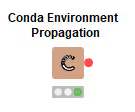 | Automatically installs the Conda environment necessary for your component to execute downstream R/Python nodes. The environment usually includes the R/Python installation plus precise versions of the libraries. |
Components composite views
Besides custom configuration dialogs, components can have their own custom composite views. Composite views contain the interactive views of Widget nodes, and Interactive Widget nodes and View nodes, that are part of a component.
All composite views on root level also define a web application, accessible through KNIME Hub.
To inspect the composite view in KNIME Analytics Platform, as for any KNIME node that outputs a view, right-click the component and select Open view after execution.
You can also customize the layout of the composite views. For more details about how to do this please refer to the Layout of composite views section.
In the next sections we will explain how to use Widget nodes, Interactive Widget nodes and View nodes to build a customized composite view.
Widget nodes
Widget nodes, similarly to Configuration nodes can provide input parameters for other nodes in the workflow. However, unlike Configuration nodes, Widget nodes are shown as widgets in the composite views. When inspecting the composite view in KNIME Analytics Platform in the window that opens you can adjust the parameters, and on the right bottom corner of the window:
- Click Apply to set these parameters for the current execution of the workflow
- Choose Apply as new default from the drop-down menu next to Apply button to set these parameters as the new default parameters for the Widget nodes
- Click Close and, choose to either discard changes, apply settings temporarily or apply settings as new default
- Choose to Close & Discard, Close & Apply temporarily or Close & Apply as new default from the drop-down menu next to Close button.
Additionally, when the workflow is deployed to KNIME Hub, Widget nodes allow you to set parameters for the workflow execution.
You can find all available Widget nodes in the node repository. Type the key word "widget" into the search bar. You can narrow down the results by selecting the tag "Widgets" below the search bar.
You can also access the Widget nodes on the KNIME Quick Forms Extension Hub page.
The Widget nodes are divided into the following five categories:
- Input: you can use widgets in this category to input parameters of different type into the workflow. For example you can input integers, strings, booleans, doubles, lists, but also other formats like date&time or credentials. They are shown in this table.
Widget input nodes
| Icon | Widget node | User input | Output |
|---|---|---|---|
 | Boolean | Booleans Checked = true Unchecked = false | Boolean |
 | String | Any user input is accepted | String |
 | Integer | Integer values | Integer |
 | Double | Floating point numbers | Double |
 | Date&Time | A date and time (as string) or selected from calendar | String |
 | Credentials | User credentials (user name and password) for later use in authenticated nodes | Credentials Flow Variable |
 | File Upload | Upload a file to the server using a temporary folder | Path to the uploaded file |
 | File Chooser | Select one or multiple remote files, workflows or folders | Table with paths to selected items (as knime:// protocol). First path as flow variable |
 | List Box | Separate string inputs | Data table with a column of string values |
 | Slider | Value on a slider | Double |
 | Molecule * | Molecule string in specified format, e.g., SMILES notation | Molecule string in specified format (can be edited). Molecule can be sketched. |
* Requires extension(s)
- Selection: you can use the widgets in this category to select input values from an available list of values. For example, you can choose a specific column from a data table, multiple columns to include or exclude from a dataset or select a value of a chosen column to filter a data table. You can also enable the choice of single or multiple values from a list, or a single value from a single column of a data set. They are shown in the table below.
Widget selection nodes
| Icon | Widget node | User input | Output |
|---|---|---|---|
 | Single Selection | Choice of the available values. The available selection depends on the node’s configuration. | String |
 | Multiple Selection | Multiple selections | Data table with a column of selections |
 | Column Selection | Column name | String |
 | Value Selection | Value in a column | String |
 | Column Filter | Select columns from a data table | Data table with selected columns |
 | Nominal Row Filter | Value in a column | Data table with row filtered according to the selected value |
- Output: you can use these widgets to either produce a link to download files or to display images or dynamic text. They are shown in table below.
Widget output nodes
| Icon | Widget node | User input | Output |
|---|---|---|---|
 | File Download | File path | A flow variable storing an absolute file path |
 | Image Output | Image (SVG) or Image (PNG) | KNIME Image |
 | Text Output | Any text | String or HTML content |
- Filter: you can use these widgets to trigger interactive filter events in a layout of views. In the next section these interactive widget nodes are explained in more details.
- Re-execution: you can use the Refresh Button Widget node to add a button widget with configurable text to the composite view of the component. When the user clicks the button it will emit reactivity events that trigger re-execution of the component downstream nodes. In the Refresh Button Widget node section you will find more detailed information on the functionality and outcome of the reactivity functionality of the Refresh Button Widget.
You can arrange different Widget nodes in a composite view, enclosing them into a component, where ideally you could adjust different parameters to be injected into the workflow.
View nodes
You can use View nodes to visualize your data as charts, plots, tables. You can choose between two KNIME extensions to leverage their potential, as described in the following.
KNIME Views Extension
The KNIME Views Extension for the KNIME Analytics Platform provides nodes for creating interactive visualizations within workflows. Interactivity between multiple views is currently only possible for views coming from the KNIME Views Extension.
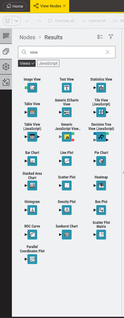
Type the key word "view" in the search bar. You can narrow down the results by selecting the tag "Views" below the search bar.
You can also access the KNIME Views Extension on the KNIME Hub.
One example of a component made of four different View nodes: 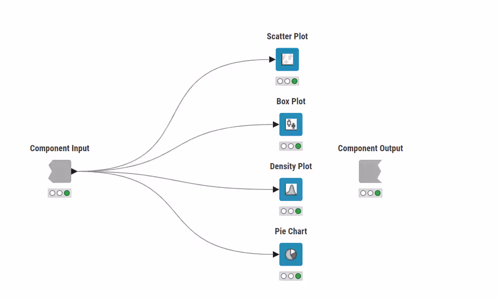
Once this component has been executed, right-click, select Component → Open view in the KNIME Analytics Platform. An interactive dashboard like the one shown below will appear. 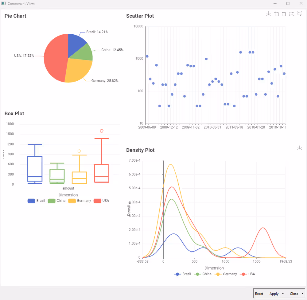
The layout can be adjusted as explained in the Layout of composite views section and different elements can be added like text or images, with the use of Widget nodes.
Each node’s configuration dialog provides:
- A preview pane to adjust settings based on how they affect the visualization
- An input field where you can set a title
Missing, infinite or not a number (NaN) values are excluded in all View nodes except for the Histogram node. You can choose different ways of handling them in the configuration dialog.
The extension includes the nodes shown in the table below. All nodes have the option to output a rendered image of the generated visualization.
KNIME Views Extension nodes
| Icon | View Node | Input | Output | Example Output |
|---|---|---|---|---|
 | Bar Chart | Data table containing categories and values | Bar chart visualization | 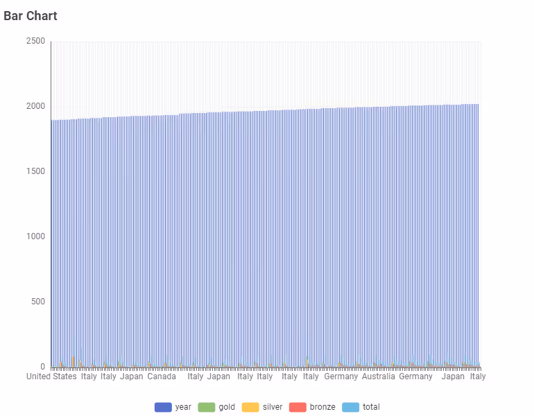 |
 | Box Plot | Data table with dimensions and conditions | Box plot visualization | 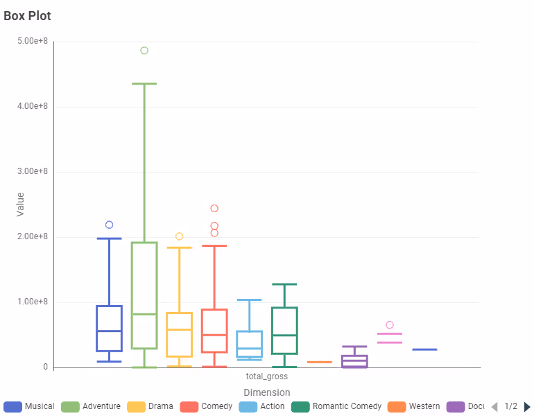 |
 | Density Plot | Data table with dimension and condition column | Density plot visualization | 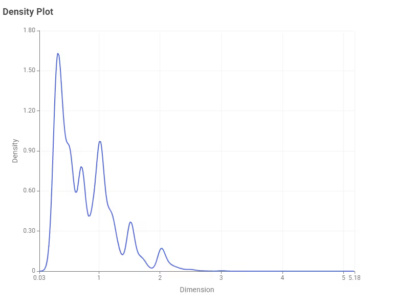 |
 | Heatmap | Data table with categories and values | Heatmap visualization |  |
 | Histogram | Data table with values | Histogram visualization | 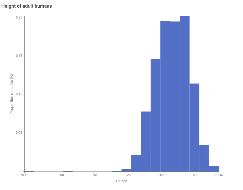 |
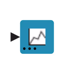
 | Image View | Image data | Image display | 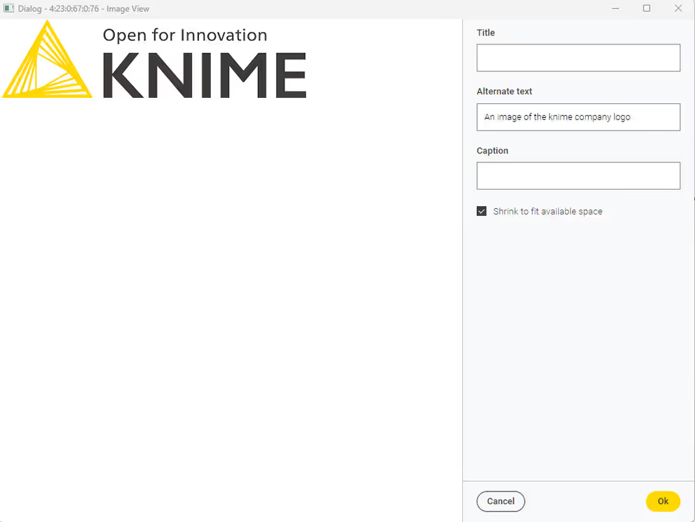 |
 | Line Plot | Data table | Line plot visualization | 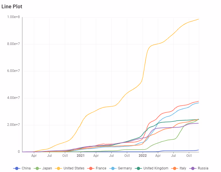 |
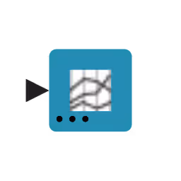 | Parallel Coordinates Plot | Data table | Parallel coordinates visualization |  |
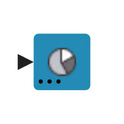 | Pie Chart | Data table with categories and values | Pie chart visualization | 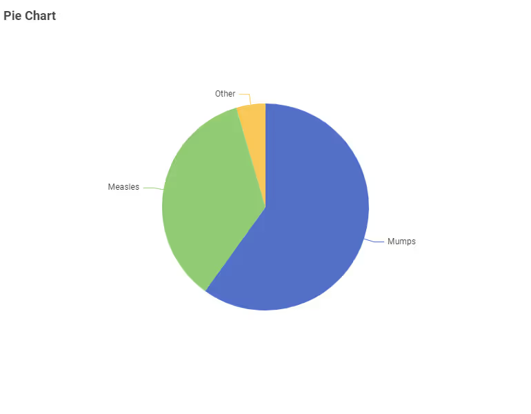 |
 | ROC Curve | Data table | ROC curve visualization | 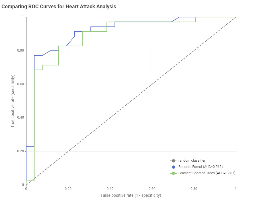 |
 | Scatter Plot | Data table | Scatter plot visualization |  |
 | Scatter Plot Matrix | Data table | Scatter plot matrix visualization |  |
 | Stacked Area Chart | Data table with categories and values | Stacked area chart visualization | 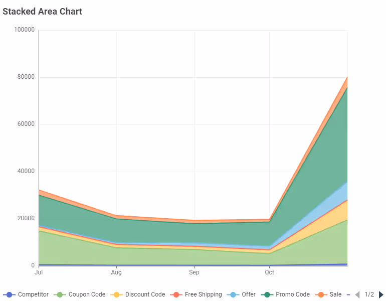 |
 | Statistics View | Data table | Statistics visualization | 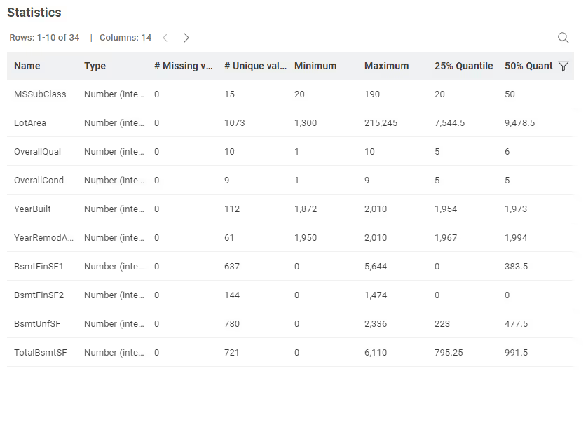 |
 | Sunburst Chart | Data table with hierarchical data | Sunburst chart visualization | 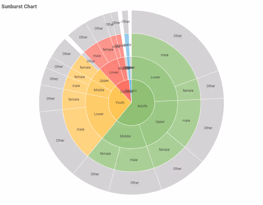 |
 | Table View | Data table | Table visualization | 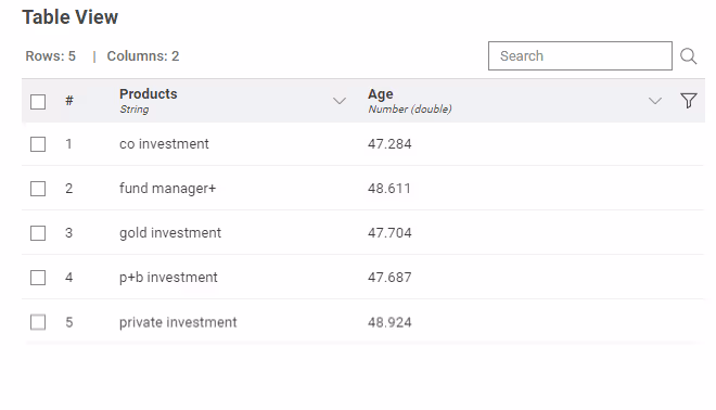 |
 | Generic ECharts View | Data table | Custom ECharts visualization | 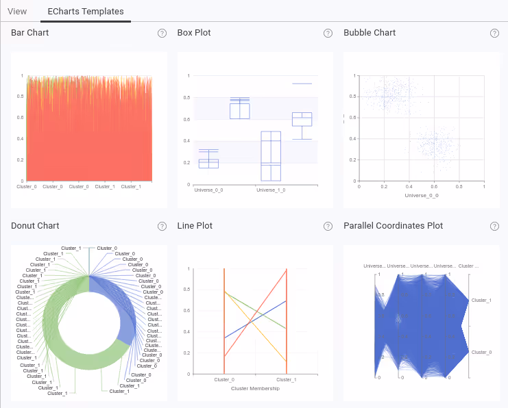 |
 | Text View | No input port; rich text added in config dialog | Text display | 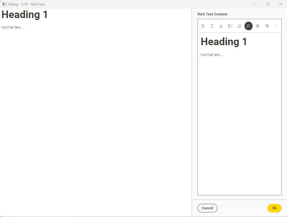 |
KNIME Generic ECharts View Node
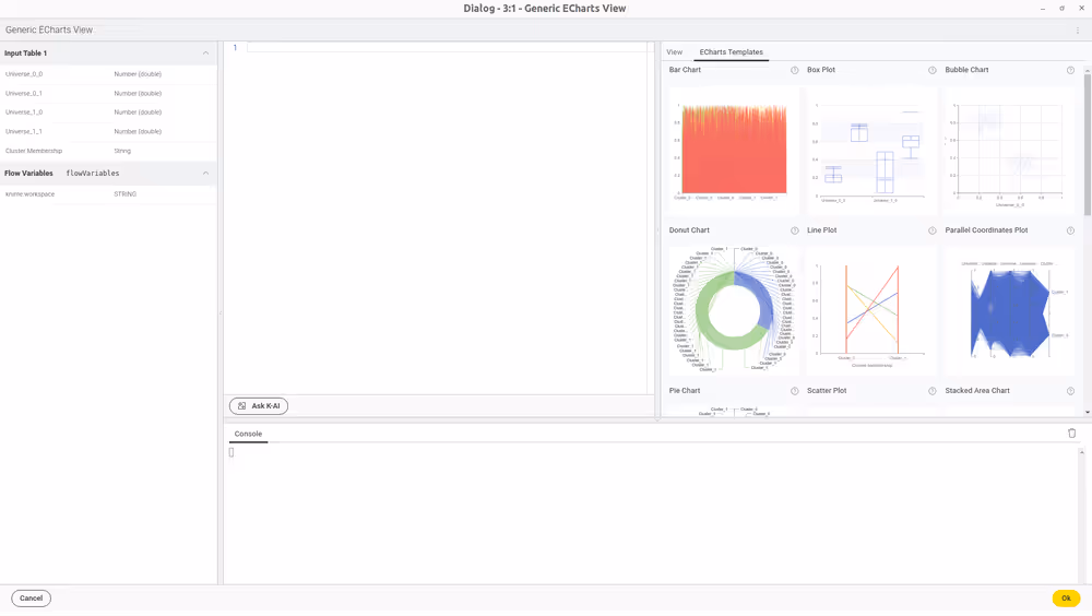
The Generic ECharts View node is a special View node that combines the functionality of multiple views, e.g. Bar Chart, Line Plot, Scatter Plot and many more. It contains a script editor where you can write your own JavaScript code to generate a view with the Apache ECharts library. You can also use the templates provided in the node configuration dialog.
In addition to the templates, more examples can be found on the Apache ECharts website.
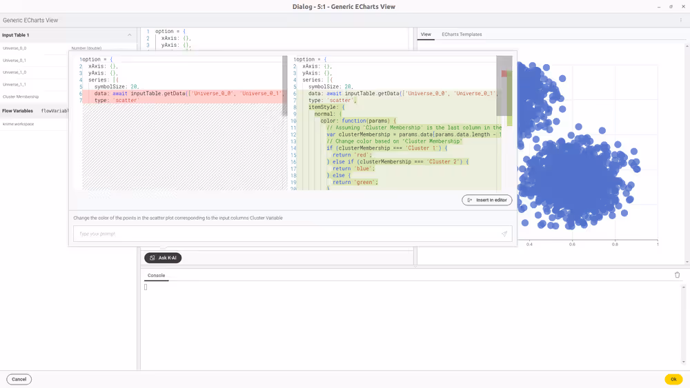
Furthermore, when logged into KNIME Hub, you can utilize the KNIME AI Assistant to generate JavaScript. To do so there is a button called 'Ask K-AI' in the node configuration dialog. Clicking on it will open a dialog where you can ask the AI Assistant to generate a chart for you, for instance, by typing in a question like "Generate a scatter plot for the two universes in the input data". You can then press 'Insert in editor' to insert the generated code into the script editor. The view on the right side will automatically update. You can then adjust the code to your needs or try a follow-up prompt.
For more information on the KNIME AI Assistant please refer to K-AI.
Before using the KNIME AI Assistant, be aware that the current code from the editor, the input data’s schema, and the prompt are sent over the internet to the configured KNIME Hub and OpenAI, which is a consideration for data privacy. This transmission is necessary for the AI to tailor code suggestions accurately to your script’s context and the data you are working with.
KNIME JavaScript Views Extension
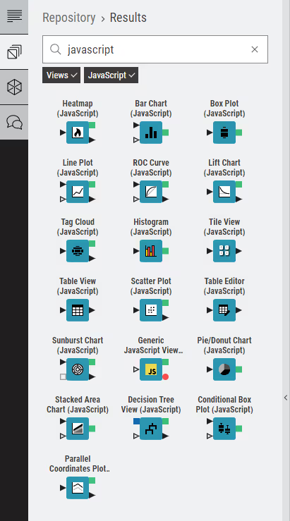
You can use nodes from the JavaScript Views Extension to visualize your data as charts, plots, tables, or visualize your own views generated from JavaScript code. The nodes are available in the node repository. Type the key word "javascript" in the search bar.
Narrow down the results by selecting the tags "JavaScript" and "Views" below the search bar until the node repository looks like:
You can also access the KNIME JavaScript Views Extension on the KNIME Hub.
These nodes can also be combined together in a component in order to build composite views and dashboards.
Refresh Button Widget node
You can use the Refresh Button Widget node within a component to add a button widget with configurable text to its composite view. When user clicks the resulting button in the composite view a reactivity event will trigger re-execution of the component downstream nodes. This will result in the update of the visualizations of the composite view corresponding to the Widget and the View nodes that are in the branch downstream to the Refresh Button Widget node. To use the node, connect the flow variable output port to the nodes which should be re-executed. The downstream nodes of those connected nodes will also be re-executed when the widget is clicked.
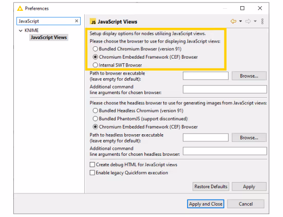
Please note that the Refresh Button Widget works in KNIME Analytics Platform only when using the Chromium Embedded Framework as browser for displaying JavaScript views. In case Chromium Embedded Framework is not set as the default you need to configure it. To do so go to File > Preferences and find JavaScript Views under KNIME. Set the first pane to Chromium Embedded Framework (CEF) Browser.
The re-execution functionality is available only if the legacy flag in the Composite View Layout tab of the Node Usage and Layout window is deactivated.
This is an example of a workflow bundled in a component.
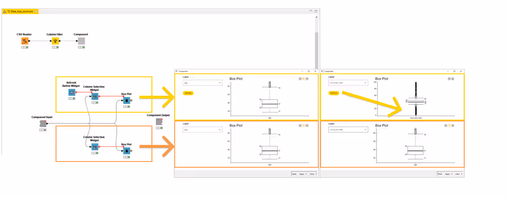
The first branch (yellow rectangle) has a Refresh Button Widget node, connected via flow variable port to a Column Selection Widget node and a Box Plot node. The second branch instead does not have the Refresh Button Widget node connected. In the resulting composite view is possible to choose the columns to be plotted in the Box Plot views. When clicking the Refresh button only the first Box Plot view is showing the selected column.
Re-execution of Widget nodes
Complementary to the functionality of the Refresh Button Widget node it is also possible to configure some of the Widget nodes (Selection Widget nodes and Boolean Widget node) so that the change in their value in the composite view upon user interaction will directly trigger re-execution of the component downstream nodes. This will result in the update of the visualizations of the composite view corresponding to the Widget and the View nodes that are in the branch downstream to the re-executable Widget node. In order to activate this option open the Widget node configuration dialog, go to Re-execution tab, and check the option Re-execution on widget value change, as shown here:
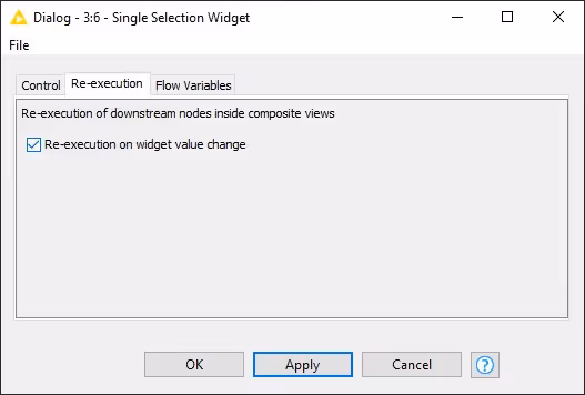
When the re-execution option is selected the Widget node will have the icon on the right upper corner of the node, as shown here:
Please note that the re-execution of Widget nodes works in KNIME Analytics Platform only when using the Chromium Embedded Framework as browser for displaying JavaScript views. In case Chromium Embedded Framework is not set as the default you need to configure it. To do so go to File > Preferences and find JavaScript Views under KNIME. Set the first pane to Chromium Embedded Framework (CEF) Browser.
The re-execution functionality is available only if the legacy flag in the Composite View Layout tab of the Node Usage and Layout window is deactivated.
Interactive Widget nodes
Interactive Widget nodes are special Widget nodes that can be combined together with View nodes in order to build composite views where you are allowed to interactively filter the data visualized in the View node(s) connected to them, acting on the different elements which are integrated in the composite view.
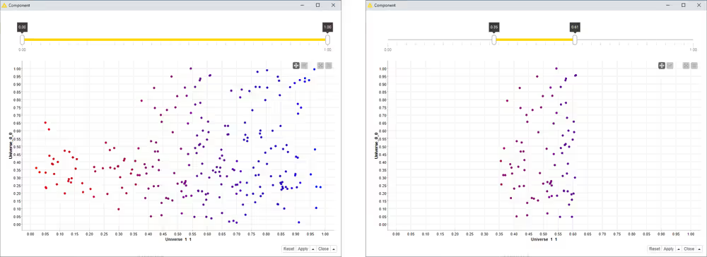
Interactive Range Slider Filter Widget
This Interactive Widget node shows a slider in a composite view. You can define the column to be filtered according to the slider and the range, together with different configurations and settings, in the node configuration dialog.
An example about how to use this Interactive Widget node is available on the KNIME Hub.

Two snapshots of the interactive composite view are shown here below. The range of values that are filtered and plotted is adjusted with the slider.
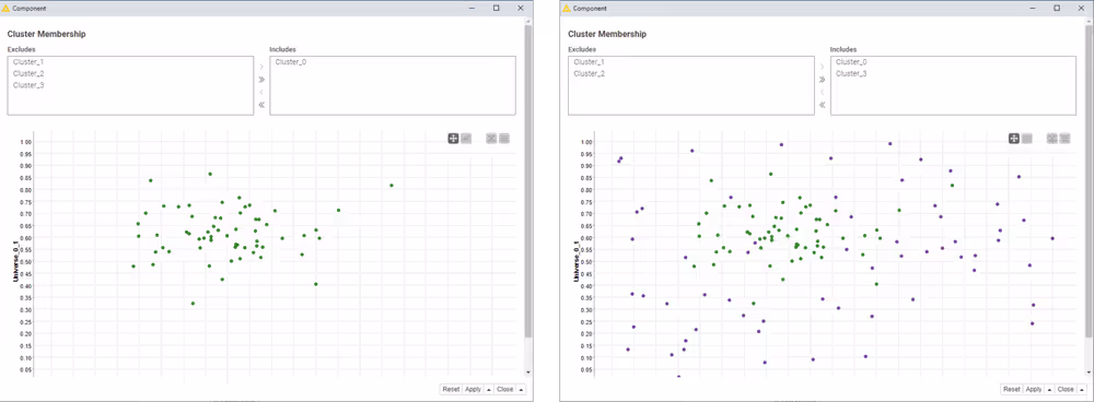
Interactive Value Filter Widget
This Interactive Widget node shows a filter in a composite view. You can define the column to which the values are filtered. You can also have different configurations for this widget like choose a single or multiple values, and other settings, that you can configure in the node configuration dialog.
An example about how to use this Interactive Widget node is available on the KNIME Hub.

Two snapshots of the interactive composite view are shown here below. The values of the chosen column that are included or excluded and plotted is adjusted with the include/exclude element on the top.
Layout of composite views
Any component that contains at least one Widget or JavaScript view node can have a layout defined. The layout can be edited within the Composite View Layout tab of the Node Usage and Layout window.
To access the layout editor you can either:
- Open the component and click the Open layout editor button, as shown here:
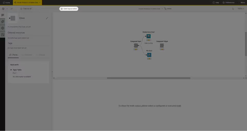
Visual layout editor
The visual layout editor allows you to create and adjust layouts using a drag & drop grid.
- A layout consists of one or more rows. Each row can have up to twelve columns.
- A column can be resized when there is more than one column in a row
- One or more views can be added to a column
- By default the position of widgets and views in the custom view follows the position of the corresponding nodes in the component sub-workflow, from top to bottom.
The visual layout editor, consists of a left panel which shows a list of all Widget and View nodes in your component that have not yet been added to the layout and an interactive preview of the layout on the right.

To add a view, drag it from the left panel (1) to the desired position in the layout preview.
To add a column, click the '+' button (2) in the layout preview.
To resize a column, click and move the resize handle between columns (3).
To add a row, drag a row template (4) from the left panel to the desired position in the layout preview. You can choose between different templates, e.g. 1-column, 2-column, 3-column or you can add and remove columns later on.
To delete a view, column or row use the trash bin button (5). This is only available for columns and rows when they are empty, i.e. do not contain widgets or views.
To move a view into another column drag it to the layout preview. Complete rows can also be moved by dragging.
Note that nesting is possible. Columns can contain rows as well as views, those nested rows can contain columns, rows, and views, and so on.
You can also adjust the height of the views. Each view has default sizing settings which can be changed via the cog icon (6) in the layout preview. You can choose between automatic height based on the content of the view or aspect ratio sizing (16:9, 4:3 or square). When using automatic height it is possible to define minimal and maximal pixel sizes.
If you have switchable views or widgets within your component, for example if you are using a Refresh Button Widget node combined with IF and CASE Switches, you need to insert all the switchable views and widgets in your layout by positioning them within the same cell of the Composite View Layout.

Layout options for composite views with switchable views
When building a component to be deployed as a page of a Data App you might want to give the final Data App user the possibility to choose the type of visualization they want to see in a specific position of the page. To do this you can use for example IF and CASE Switches in order to enable the user to alternatively select a visualization. When building such an application you need to insert all the View or Widget nodes that you might want to show in a specific position on the page.
Enable the reporting function of a component
The KNIME Reporting Extension KNIME Reporting Extension allows you to create and share static reports based on the results of the component's composite view of your workflows.
To use this functionality, navigate to the left side of the Composite View Layout tab of the Node Usage and Layout window and check the Enable Reporting button.
See the KNIME Reporting Guide to learn more about the reporting function in the KNIME Analytics Platform.
Legacy flag
On the left side of the Composite View Layout tab of the Node Usage and Layout window a Use legacy mode button, is available.
The Widget nodes user interface has been improved starting from KNIME Analytics Platform version 4.2.
When creating components with KNIME Analytics Platform version 4.2 the legacy mode is deactivated by default. This means that the composite views are visualized with the new improved user interfaces for the Widget nodes.
Instead, for components that have been created using Widget nodes in KNIME Analytics Platform version 4.1 and earlier, the legacy mode is activated by default. The composite views will have the previous user interface as in KNIME Analytics Platform version 4.1 and earlier.
It is always possible to check/uncheck the Use legacy mode checkbox to visualize the composite views with old/new Widget node style. This is found in the Composite View Layout tab of the layout editor for the component view.
Alternatively, in the Advanced Composite View Layout tab of the layout editor, this property can be activated/deactivated on a node-by-node basis (see (8) and (9) in the next section).
Advanced layout options
The layout structure is saved in a JSON format which advanced users can edit directly in the Advanced Composite View Layout tab.
An example of JSON format generated by the visual layout editor is shown here:

Row (1)
A row is the outer most element that can be defined and is the first element inside the layout container. The JSON structure’s outer layer is an array of rows. A row contains a number of layout-columns.
To further customize a row you can add optional fields. With additionalClasses you can provide an array of class names to append to the created HTML row element, additionalStyles (2) is an option to directly insert CSS style commands on the element. For example, to create a visual separator between one row and the next, you can add a bottom border:
"additionalStyles" : [ "border-bottom: thin solid grey;" ]
Column (3)
A column is a layout element inside a row which determines the width of its components. To define a width, use a number between 1 and 12. 12 means taking up 100% of the width, whereas 6 would be 50% of the width. In this way it is possible to define a layout with components side by side by providing their relative widths. For example, if three components are to be laid out horizontally with equal column widths use a row with three columns, each of width 4. If the sum of widths for a particular row is larger than 12, the extra columns are wrapped onto a new line.
Responsive layouts (4)
It is also possible to define multiple widths of the columns so that they can adapt to the screen size. With this option responsive layouts can be achieved.
To define the responsive width of a column, use at least widthXS and one or more of the following fields: widthSM, widthMD, widthLG.
The content of a column can be an array of one of any of the following: . Another set of rows, providing the possibility to create nested layouts . Regular HTML content, to insert plain HTML elements into the layout . A node reference to embed the contents of a JavaScript-enabled KNIME node.
As for rows, it is also possible to further customize the column using the optional fields additionalClasses and additionalStyles.
HTML content
It is possible to include plain HTML into the layout by placing a content element of type html inside a column. To insert the content a single field value is used.
For example:
[...]
"content":\[{
    "type":"html",
    "value":"<h2 >Title defined in layout</h2>"
  }\]
[...]
Starting with KNIME Analytics Platform 5.8, any HTML content entered in the Advanced Layout section of a component view layout will be automatically sanitized. This means that potentially unsafe or unsupported HTML elements and attributes will be removed before rendering, to improve security and stability. If your component view relies on custom HTML for styling or interactivity, review your layouts after upgrading to ensure they still behave as expected.
View content (5)
To embed the contents of a KNIME node inside the layout, you can use a content element with type view. The element has quite a few ways to customize the sizing and behavior of the content.
Referencing the node is done by the field nodeID (6), which takes the ID-suffix of the node as a string argument. If nodes exist inside the component which are not referenced by the layout, a warning message appears underneath the editor. Errors will also be issued for referencing nodes twice or referencing non-existing nodes.
The content of each is wrapped in its own iframe element, allowing to encapsulate the implementation and avoid reference and cross-scripting issues. As iframe elements do not adapt to the size of their content automatically, you need to resize them to achieve the desired behavior. To achieve this result you have the following options:
- Size-based methods: This method uses an iframe-resizer library to resize the
iframeaccording to the size of its contents. You will need to explicitly or implicitly set a concrete size for the content. You can determine the size using different approaches, as explained on the iframe-resizer GitHub page. Size-based resize methods all start with the prefixViewin the JSON structure. - Aspect-ratio based methods: If a node view is set to adapt to its parent size, rather then implicitly providing a size, the size-based methods will either not work properly. To allow these views to take up an appropriate amount of space in the layout an aspect ratio setting can be used. Here the width is taken as 100% of the horizontal space available at that position in the layout and the height is calculated according to the given ratio. Aspect-ratio based resize methods start with the prefix
aspectRatioin the JSON structure. - Manual method: You can also trigger manually resize events at appropriate times. This requires the implementation of the node to make the appropriate resize calls itself.
In the table below a list of available fields to personalize the view content (7) is shown.
Fields to personalize the view content
| Field name | Explanation / Possible Values |
|---|---|
nodeID | ID-suffix of referenced node |
minWidth | Constrain the size of the iframe by setting a minimum width in pixels. |
minHeight | Constrain the size of the iframe by setting a minimum height in pixels. |
maxWidth | Constrain the size of the iframe by setting a maximum width in pixels. |
maxHeight | Constrain the size of the iframe by setting a maximum height in pixels. |
resizeMethod | The resize method used to correctly determine the size of the iframe at runtime. Can be any of the following values: viewBodyOffset, viewBodyScroll, viewDocumentElementOffset, viewDocumentelementScroll, viewMax, viewMin, viewGrow, viewLowestElement, viewTaggedElement, viewLowestElementIEMax, aspectRatio4by3, aspectRatio16by9, aspectRatio1by1, manual |
autoResize | Boolean only working with size based resize methods. Use this to enable or disable automatic resizing upon window size or DOM changes. Note that the initial resize is always done. |
resizeInterval | Number only working with size based resize methods. Sets the interval to check if resizing needs to occur. The default is 32 (ms). |
scrolling | Boolean only working with size based resize methods. Enables or disables scroll bars inside iframe. The default is false. |
sizeHeight | Boolean only working with size based resize methods. Enables or disables size adaption according to content height. The default is true. |
sizeWidth | Boolean only working with size based resize methods. Enables or disables size adaption according to content width. The default is false. |
resizeTolerance | Number only working with size based resize methods. Sets the number of pixels that the content size needs to change, before a resize of the iframe is triggered. The default is 0. |
additionalClasses | Array of additional classes added to the HTML container element. |
additionalStyles | Array of additional CSS style declaration added to the HTML container element. |
Parent legacy mode (8) (9)
The parentLayoutLegacyMode (8) is activated (true) to allow all Widget nodes contained in the component to use the legacy mode. Each individual Widget node can also be unset from the legacy mode setting the option (9) useLegacyMode to false.
Node Usage tab
The first tab of the layout editor is the Node Usage tab. Here you can choose which Widget nodes to show in the composite view checking/unchecking them in the WebPortal/Component View column.
It is best practice to avoid the usage of Quickform nodes and use instead Configuration nodes and Widget nodes. However, in case you are using Quickform nodes in your components and you want to hide them you can do it in the Node Usage tab.
Check or uncheck the node in the WebPortal/Component View column to show it or hide it from the composite view. Check or uncheck the node in the Component Dialog column to show it or hide it from the configuration dialog.
Layout of configuration dialogs
The last tab of the layout editor is the Configuration Dialog Layout.

Here, you will find all the Configuration nodes that are part of the component. You can easily drag and drop them to resort their position which then they will have in the component configuration dialog.
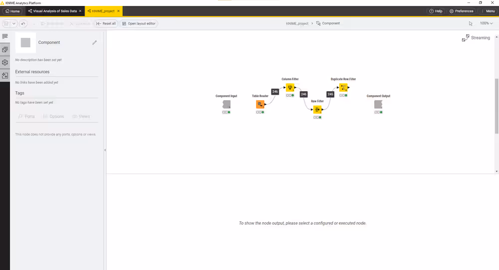
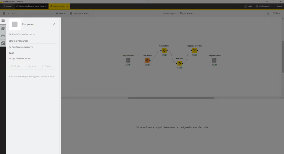
Streaming execution of components
You can define the mode of execution of components, e.g. in which order and how the data are passed from one node to another in the sub-workflow. After installing the KNIME Streaming Execution (Beta) extension, in each component configuration dialog you can find a Job Manager Selection tab. Not all nodes support streaming execution. However, streaming execution can be applied to entire sub-workflows inside a component. Notice that the non-streamable nodes can still be part of a sub-workflow inside a component, which is executed in the streaming mode. They will simply be executed in the default execution mode.
The KNIME Streaming Execution (Beta) is an extension available under KNIME Labs Extensions. Install it by navigating to Menu - > Install extensions.
The execution can be performed in default or streaming mode which are described in the next sections.
Default execution
In the default execution mode, the operations in a workflow are executed node by node. Data are passed from one node to another after the entire input data of a node has been processed. The dataset passed to the next node is the intermediate output table, which you can inspect by opening the output table of a node in the middle of a workflow.
If you open the Job Manager Selection tab in any configuration dialog, and see the job manager selection <<default>>, then the node operation is executed according to the default execution mode.
Streaming execution
In the streaming execution mode, data is passed from one node to another as soon as it is available. That is, all data do not have to be processed at once, but they can be divided into a number of batches which are streamed one by one. Therefore, the streaming execution mode leads to a faster in-memory execution because only the rows in transit are concerned and intermediate tables are not stored.
To switch from default to streaming execution select Simple Streaming under the Job Manager Selection tab in the component or node configuration dialog. If the streaming execution option is not available for the node you will only see the <<default>> option in the menu.
Here, for streaming execution mode, you can also choose the size of the batch to be streamed, as shown here:
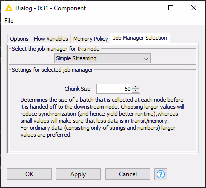
Larger values will reduce synchronization, with better runtime, while small values will assure that less data is in transit.
Streaming execution of a component
If you use the streaming mode to execute a component, the sub-workflow inside it is always executed entirely. The intermediate output tables of the nodes inside the component are not available, because they are not stored. Each batch of data is streamed one by one through the streamable nodes of the sub-workflow. If they reach a non-streamable node they will be stored there until all the batches have been streamed. Then they are again divided into batches and passed to the next streamable node(s).
The component and the streamable nodes in the component sub-workflow show a dashed black arrow on the right bottom corner, while the nodes show an X, if they are not. The numbers that appear above the connection between nodes refer to the number of records that have passed that particular connection.
Error Handling
Error handling is a significant issue that needs to be addressed while building a workflow. While executing a workflow, you might encounter various errors. For instance, a failing connection to a remote service, the invocation of a non-accessible database etc. It is necessary to provide an error handling method that alerts if a node execution fails. While building a component, Breakpoint node can be used for error handling.
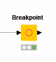
The node can be used to detect whether the input or configurations of the component satisfy the minimum requirements. It can also be configured to provide a customized error message to the user about what should be fixed if the component execution fails. Thus, when specified conditions are not met the error message appears on the node and on the outside of the component.
Edit components description
As each component is a real KNIME node you can also change its description, provide a name and a description for output and input ports, and customize the component icon.
To do this open the component by either right-clicking it and going to Component → Open component in the context menu or "ctrl" + double-clicking it. Open the Description tab from the side panel navigation.
Click on the pen icon on the right upper corner to change:
- Description: you can insert here a description of the component
- Type and icon: you can select a a square image file, png format of a minimum size of 16x16, and select the type from the drop-down menu, to setup background color.
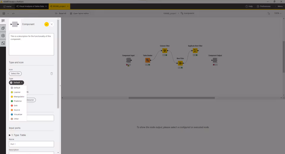
- External resources: you can add links to useful resources.
- Tags: add meaningful tags to the component
- Name and Description of input and output ports: the name of input and output ports will also be visible on the input and output ports hover of the component in the workflow editor.
Sharing components
Components encapsulate functionalities that can be reused as your personal customized KNIME nodes, to perform tasks that you often repeat, or you can simply store them for further reuse for yourself. They can also be shared with others via KNIME Hub and KNIME Server.
After you create a component in a workflow, if you would like to reuse it in some other workflow you could copy paste it in to the new workflow. However, in this way, changes to the component in one workflow are not triggered to the others. You can obtain changes to the component to be applied to the others by sharing and linking components.
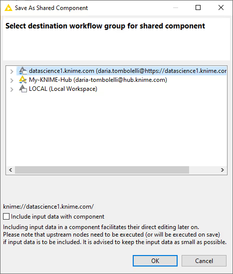
To share a component, right-click it, select Component → Share from the context menu, and choose the destination for the shared component in the window that opens.
Here you can choose:
- The mountpoint where to share the component
- To include or exclude the input data eventually present with the component.
Please be aware that if input data are included they will be accessible to everyone who has access to the component itself.
Share components in local workspace
If you choose to save a component in your local workspace you can have access to that component from your local KNIME Analytics Platform installation.
Share components on the KNIME Hub
You can also save and share components in the KNIME Hub. Here you can share into a private space, having therefore access to them logging in to your KNIME Hub profile, or into a public space, sharing your components with the KNIME Community.
Share components on the KNIME Business Hub
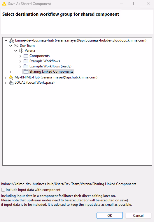
Similar to the KNIME Community Hub, you can also save and share components on the KNIME Business Hub. Here you can save the component to a team space and share it with the members of your team.
To save a linked component to the KNIME Business Hub, right-click it, select Component → Share from the context menu. In the Save As Shared Component window, select your Business Hub instance and the space where the component will be saved.
Link type
The link type defines how a workflow looks for the shared component when checking for updates.
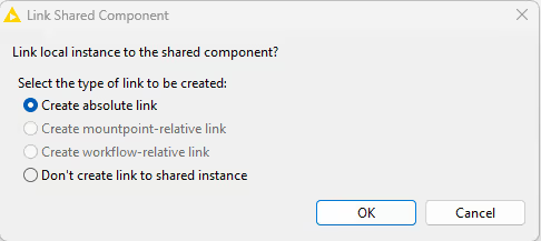
After choosing the destination of your component, a dialog opens asking you to choose for the link type you want to use.
Upon saving a linked component locally, you have the following four possibilities:
- Create absolute link: the workflow connects to the absolute location of the shared component
- Create mountpoint-relative link: the workflow connects to the shared component based on the folder structure under which mountpoint the workflow lives. If you deploy a workflow to a KNIME Server you have to deploy the shared component as well, and keep the path from the mountpoint to the component the same.
- Create workflow-relative link: the connection between the shared component and a workflow where an instance of it is used is based on the folder structure between the workflow and the shared component
- Don’t create link with shared instance: creates a shared component but does not link the current instance to it.
If you share a component on the KNIME Server, the KNIME Community Hub or the KNIME Business Hub, you can only choose between creating an absolute link or not creating a link at all, as indicated by the Link Shared Component dialog shown here:
After selecting the proper link type click OK and the shared component appears in KNIME Explorer within the folder it was saved to.
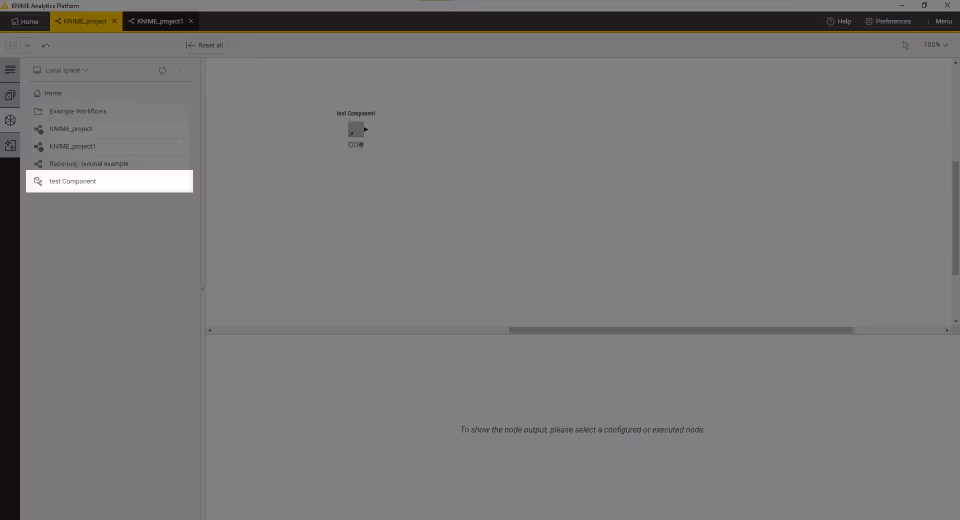
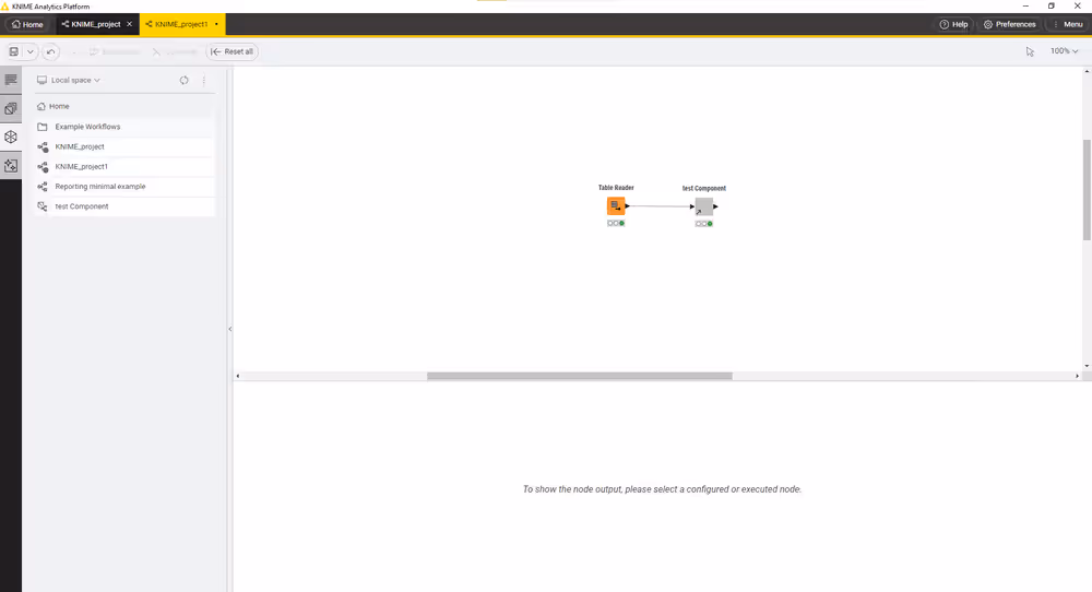
Use a shared component
To use a shared component in a workflow, you can drag and drop it into the workflow editor. An arrow on the bottom left corner indicates that the component is an instance of a shared component. You can use the component as a KNIME node, using the functionalities that have been enveloped into it, like configure it or visualize its output(s) or interactive views.
Edit the instance of a shared component
To check the link type of a certain instance or to customize it for a specific instance, right-click the instance and choose Component → Change link type from the context menu. The dialog shown here will open:
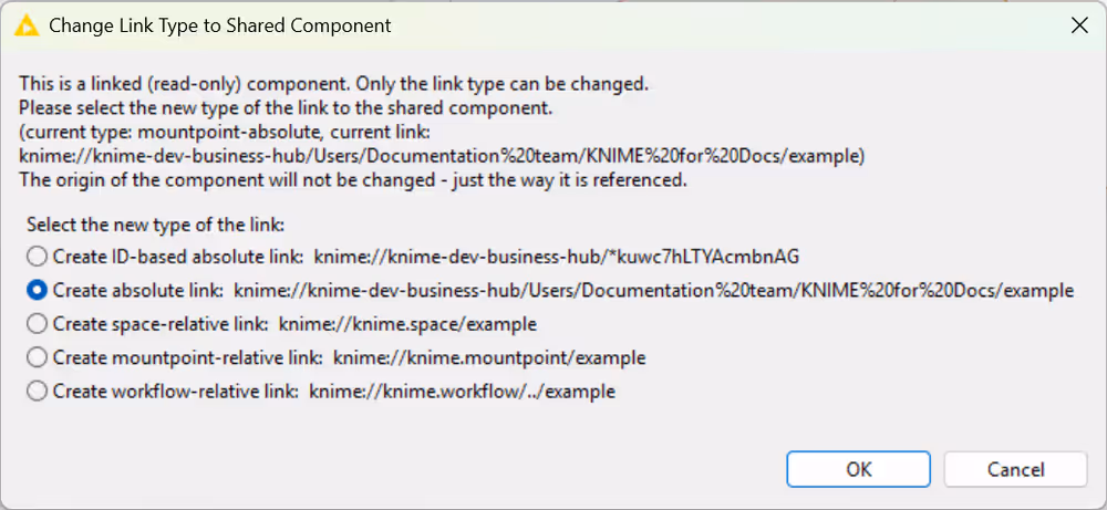
There, you can choose the new type of link.
When you open an instance of a shared component, a blue bar indicates that you cannot make any changes to the current instance of the component.
To be able to edit the instance, you must first unlink it from the shared component. Right-click the instance and select Component → Disconnect link.
After disconnecting the component, you can resume making changes to it by clicking Component → Open. To save these changes to the previously created shared component, right-click the edited component instance and select Component → Share. Then select the folder in which the shared component is located and overwrite it. You also have the option of saving the changes to a new component with a different name.
To verify that the current instance of the component in use is the latest of the linked shared component, right-click the current instance and select Component → Update component. If updates are available, you will be notified when opening a tab with a workflow where an instance of the component is used. Click Update to update the current instance of the shared component.
Edit a shared component
You can edit a shared component by opening it directly from the space explorer. You can now modify the sub-workflow contained in the component by adding or deleting nodes, changing the parameters of individual nodes, or changing the layout of composite visualizations.
Update linked components
You can choose to automatically update the linked components that are eventually reused in a workflow. The first time you open a workflow that uses an instance of a shared component, you will be prompted to choose whether to check for updates to these components.
Version a component shared to KNIME Hub
You can create versions of your shared components so that you can return to a specific saved version at any point in the future to download the item in that specific version. Versioning a component works like versioning a workflow, as detailed in the KNIME Business Hub User Guide.
To version a component, it must first be shared on the KNIME Hub.
Once you have shared your component, access its location on the KNIME Hub. Alternatively, you can access the component through the KNIME Analytics Platform. Navigate to the component in the space explorer, right-click it, and select Open in Hub.
On the component Hub page, click History. A panel opens on the right, where you can see the unversioned changes to the component.
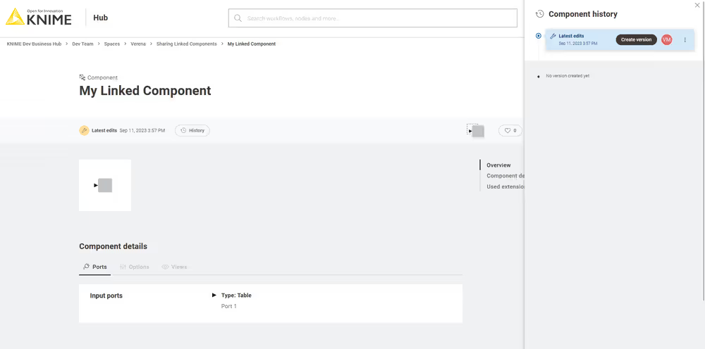
To create a new version, make sure you are signed in, then click Create version. You can then name the version and add a description. After you click Create, the new version of your component appears in the panel on the right. Any future edits to the component will appear there as unversioned changes, which can then be versioned again, as described above.
Change component version to use
This feature is currently available only in the classic user interface. Switch to classic user interface by clicking Menu > Switch to classic user interface.
When working with a linked component in a specific workflow, you may want to specify which version to use in the current workflow. This is possible if the component is uploaded to a KNIME Hub instance and has different versions. To do so, right-click the component and select Component → Change KNIME Hub Item Version. In the Select KNIME Hub Item Version dialog, you can choose between three options.
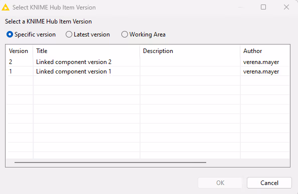
Specific version
If you select this option, the component instance is set to one specific version created on the Hub. In the current workflow, it will not be affected by any future changes.
Latest version
The component instance will be updated to the latest version created on the KNIME Hub. Unversioned changes are not included.
Working area
The component instance is updated whenever a change is made to the linked component. These changes do not need to be versioned yet.
Components for Data Apps
When you upload a workflow containing components to KNIME Hub, create a Data app deployment and execute it you are guided through the process in one or more pages. Each page corresponds to a component in the root level of the workflow, containing Widget nodes and View nodes.
Widget nodes
You can use Widget nodes inside a component to build a composite view that will be visualized as a web page on KNIME Hub. The use of Widget nodes is meant to set specific configurations, e.g. select a value from a specific column of a data table to filter by. In the web page you will be then able to enter values for specific parameters before proceeding with the workflow execution. These values are injected into the workflow, and used to parameterize its execution.
Interactive Widget nodes and View nodes
You can use Interactive Widget nodes and View nodes inside a component to build a composite view that will be visualized as a web page on KNIME Hub. The use of View nodes is meant to build specific visualizations, like tables, charts and plots, which are shown as a web page. Interactive Widget nodes can be also arranged together with the View nodes in order to interact with the visualizations directly on the web page.
Re-execution and Refresh Button Widget node
You can use Refresh Button Widget node inside a component to build a composite view that will be visualized as a interactively re-executable web page on KNIME Hub. The Refresh Button Widget node is used to add a button visual element to the data application that is able to re-execute specific nodes thus refreshing the desired visualizations.
You can find additional explanation on how to use KNIME Hub and how to build specific workflows in the Data Apps section of the KNIME Business Hub User Guide.