
Initialize a Custom Python Environment and Build an Interactive Data App Using Plotly
This tutorial covers how to initialize a custom Python environment with additional packages that are not included in the bundled environment, and how to transform a Plotly visualization into a functional Data App using the Python View node. You will learn how to embed Plotly charts, connect Widgets for interactivity, and deploy the result to the KNIME Hub.
Objective
Create an animated map that displays global life expectancy trends. The app uses a custom Python environment for the visualization and KNIME nodes for the interface and deployment.
What you need
- KNIME Analytics Platform: Download and install the latest version.
- KNIME Hub account for deployment. Checkout KNIME offering here.
Step 1. Download the Example Workflow
- Visit the Interactive Python Data App workflow on the KNIME Hub.
- Click Download to save the workflow file (
.knwf). - Import the file into your Local Workspace and open it.
Step 2. Configure the Python Environment
The Plotly package is not part of the bundled environment. The Python Environment Provider node manages all the background setup for a customized environment for you.
- Open the Python Environment Provider node configuration.
- Add
plotlyto the Additional dependencies list. - Click Resolve dependencies and wait for the green status indicator.
- Click Apply and execute.
TIP
To see which libraries are already included in the default environment, check the KNIME Anaconda channel.
Step 3. Write the Visualization Script
- Open the Python View node editor.
- Use the following script to render the chart and send it to the KNIME interface via
knio.output_view.
python
import knime.scripting.io as knio
import plotly.express as px

# 1. Load dataset
df = px.data.gapminder()

# 2. Define animated map
fig = px.choropleth(
    df,
    locations="iso_alpha",
    color="lifeExp",
    hover_name="country",
    color_continuous_scale=px.colors.sequential.Plasma,
    scope="world",
    animation_frame="year"
)

fig.update_layout(
    title="Life Expectancy: World View",
    margin={"r":0,"t":50,"l":0,"b":0},
    height=700
)

# 3. Output the view
knio.output_view = knio.view(fig)- Execute the node and check the Interactive View to confirm the map renders.
Step 4. Add Interactivity with Widgets
Connect selection widgets to control the map parameters.
- Selection: Use the Single Selection Widget (pre-configured with regions).
- Connection: Link the red flow variable ports from the widgets to the Python View node.
Step 5. Connect Variables to Python
Update the script to use the widget output.
- Locate the
map_scopevariable in the Flow Variables tab. - Replace the static
scopevalue in your script:
python
# Use the flow variable for the scope parameter
fig = px.choropleth(
    df,
    # ...
    scope=knio.flow_variables["map-scope"],
)
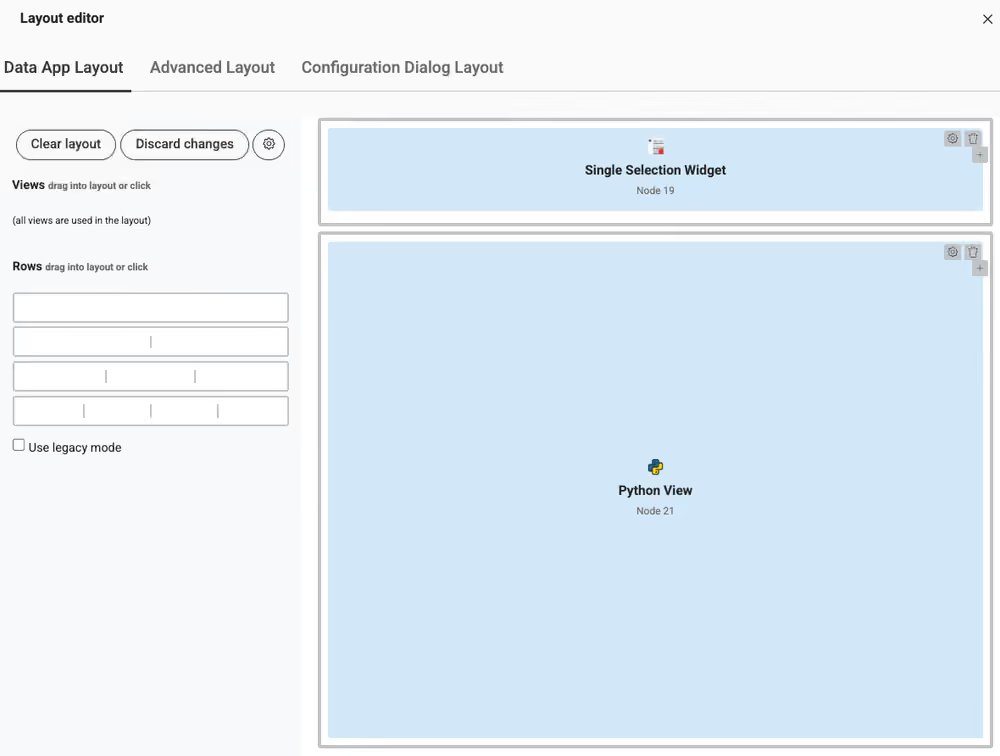
Step 6. Define the Data App Layout
- Create Component: Select the Widgets and the Python View node. Right-click the selection and select Create Component.
- Open Layout Editor: Right-click the Component, then go to Component > Open Layout Editor.
- Arrange Elements: Drag the nodes into the grid to define the visual interface for the browser.
Step 7. Deploy to KNIME Hub
- Upload: Right-click the workflow in the Explorer > Upload. Select a space you have access to.
- Create a version: Open the workflow on the Hub website. Click the Versions button and create a version.
- Create Deployment: Click Deployments and select Create Data App.
- Select Data App: Choose the Data App option to generate a web URL.
- Run and Share: Execute the app from the Deployments section or use the "three dots" menu to share the URL with other users.
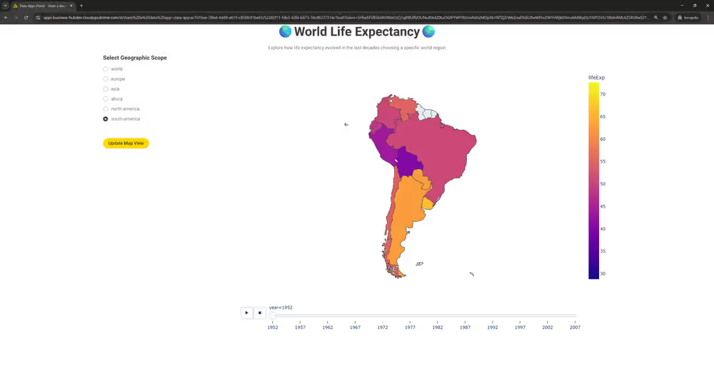
Final Result
The map is now accessible via a browser. Users can filter by region and animate the data by year using the interface you designed.
Next steps
- Data Apps for Beginners: Technical guide for building and sharing applications on the KNIME Community Hub.
- Enroll in the 30-minute course: Take the free, hands-on LearnUpon course to solidify your new skills in building Data Apps.